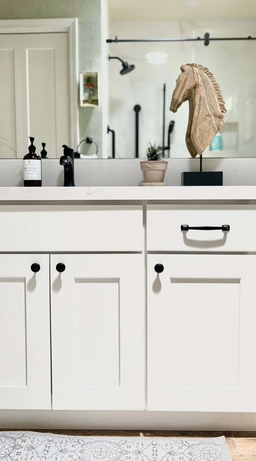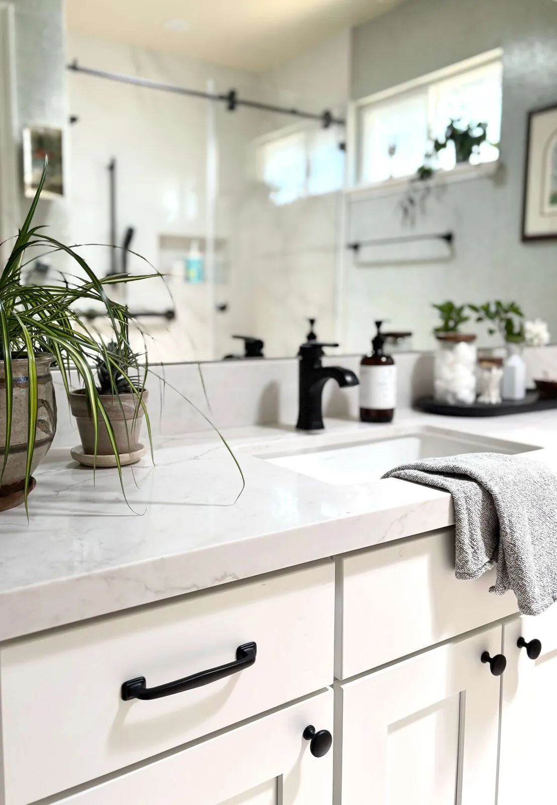
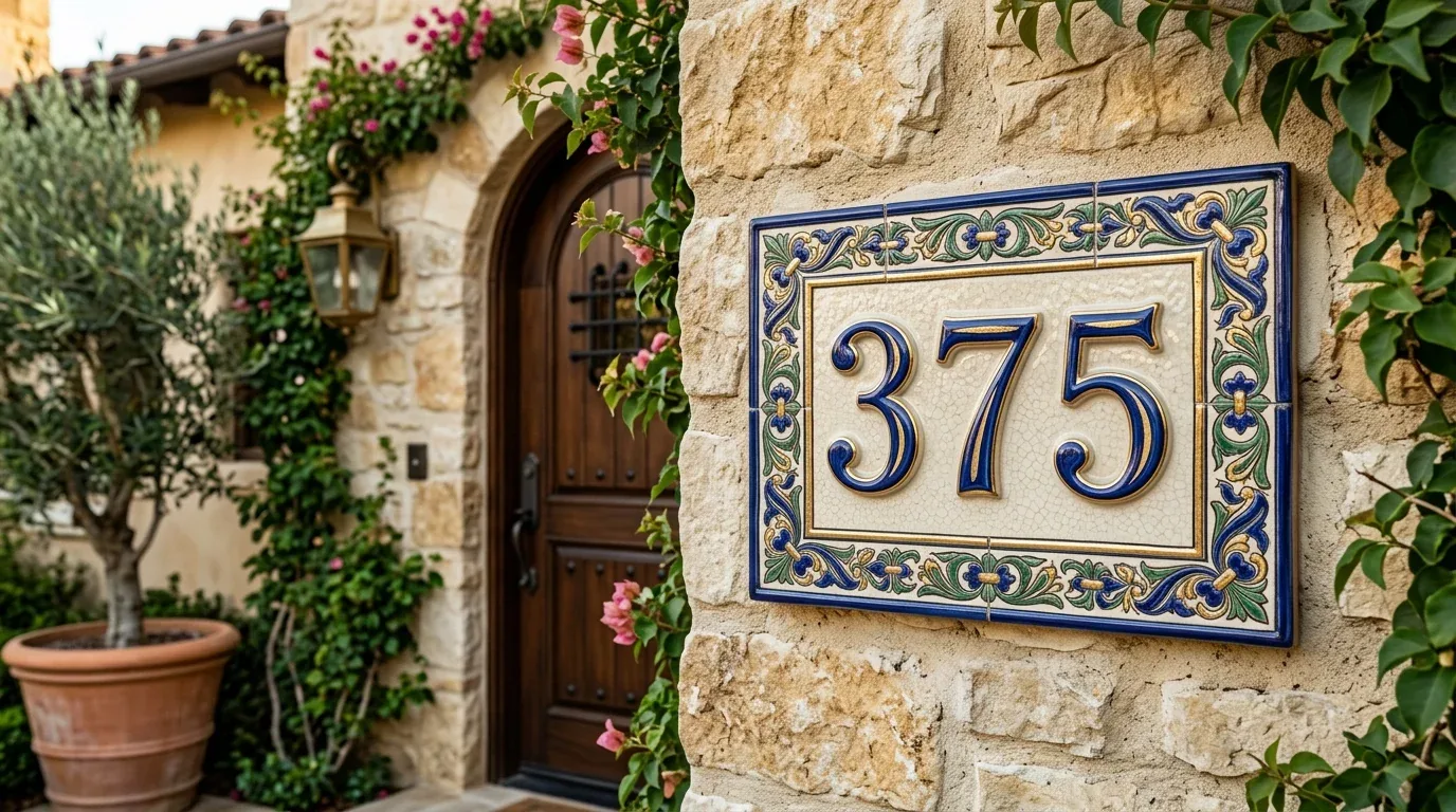
Achieving harmony in interior design means creating a space that feels balanced, unified, and pleasing to the eye. Get everything talking. A room should feel comfortable, like it was meant to be. In 2026, balance simple additions and details. Keep a warm, cohesive look. Avoid chaotic messes and clashing styles.
This piece digs into harmony using real design examples. Think about color and furniture layout. Textures count too. Consider lighting's role. We’ll share practical strategies for Sacramento homeowners aiming for a timeless, cohesive interior that reflects a refined sense of balance and a designer’s touch, grounded in a warm restraint that respects regional light and architectural context.
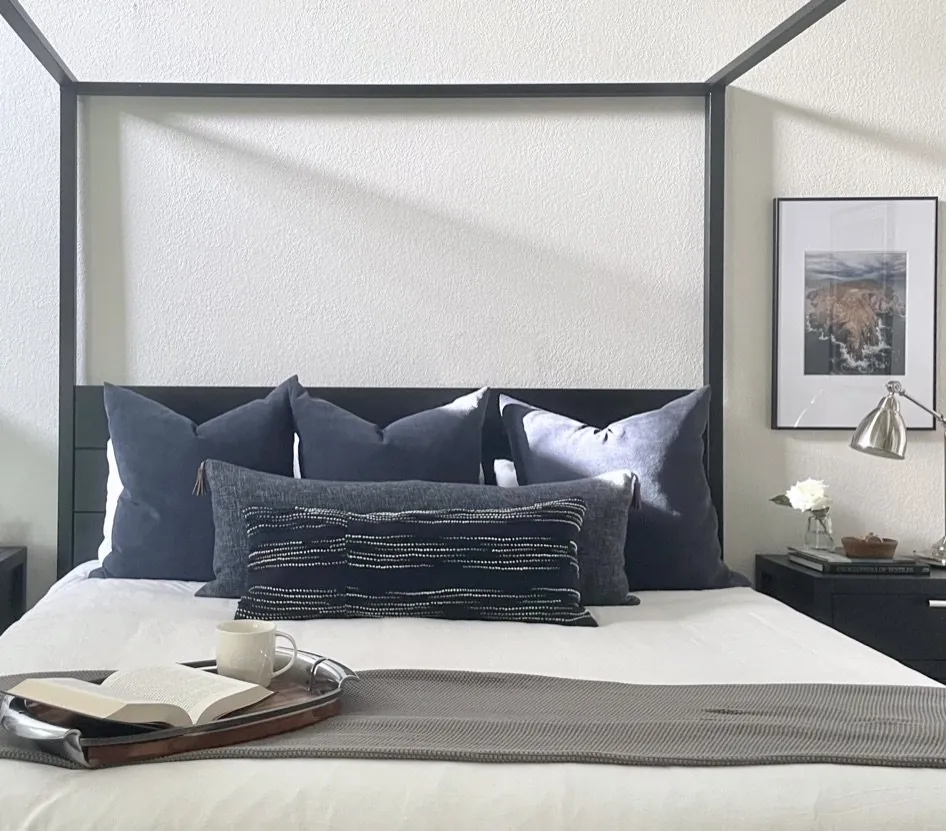
Common Questions
| What does harmony in interior design mean? | Harmony means functional cohesion—spaces where every element (furniture, lighting, materials) supports the room’s purpose without visual or physical conflict. In my work, that starts with proportional furniture layouts (e.g., a 60-inch sofa in a 12x14 living room) and intentional material pairings, like pairing matte-finish oak cabinetry with brushed brass hardware for a balanced contrast. It’s not about ‘matching’—it’s about relationships: how a color palette ties to regional light conditions, how textures avoid competing for attention. |
| How can I achieve harmony in your Sacramento home? | Start with Sacramento’s specific light conditions: the valley’s 3,000+ foot-candle brightness demands lower-LRV (Light Reflectance Value) materials—think Farrow & Ball’s ‘Skimming Stone’ (LRV 52) on walls to prevent glare, paired with deep-pile wool rugs (like Benuta’s ‘Tiburon’ in charcoal) to ground the space. Layer textures strategically: a linen sofa (e.g., Article’s ‘Sofia’ in oatmeal) against a smooth travertine floor adds tactile contrast without visual clutter. Lighting? Avoid harsh downlights—opt for adjustable sconces (e.g., Flos’s ‘Arco’ in matte black) to diffuse that valley glare. |
| Why is regional light important for interior harmony in Sacramento? | Sacramento’s 280+ sunny days annually and its warm, high-angle sunlight (color temp ~5,500K) mean traditional ‘neutral’ palettes (e.g., greige) often read as flat or dated. We push for cooler undertones—like Benjamin Moore’s ‘Revere Pewter’ (HC-172) on trim—to counteract the yellow cast of the light. Materials also shift: painted drywall (e.g., Sherwin-Williams ‘Pure White’) reflects more light than dark-stained wood, which absorbs heat and creates hot spots. The NKBA’s *Residential Design Standards* note that Northern California’s light intensity requires 10–15% higher LRV finishes than East Coast projects to avoid visual fatigue. |
| What role do color schemes play in interior harmony? | Muted, low-chroma colors (like Farrow & Ball’s ‘Green Smoke’ or Sherwin-Williams ‘Agreeable Gray’) create visual unity by reducing competition between elements—critical in open-plan Sacramento homes where natural light amplifies saturation. We use the *60-30-10 rule* but invert it for this climate: 60% in the dominant ‘cool gray’ (e.g., walls), 30% in a complementary warm tone (e.g., olive-green velvet sofa), and 10% in a single accent (e.g., terracotta pottery). The goal isn’t ‘calm’—it’s cohesion under bright light. Psychological studies (e.g., *Journal of Environmental Psychology*, 2018) show that high-contrast palettes in high-light environments increase stress; muted schemes mitigate that. |
Establishing a Cohesive Foundation Through Balance
In our design process, the first move toward harmony is establishing a balanced visual weight across the space. Furniture has to fit. Art and features must play nice. Balance is key. A big sofa needs balance. Something hefty like a fireplace works across from it. In every project, size and style guide us. Match the room's vibe.
Colors decide a room's success. They really do. Muted palettes appeal. Always have. They bring calm and stick everything together. The American Society of Interior Designers emphasizes the importance of color harmony, which can be achieved through subtle shifts in tone and temperature. Layer textures with care. Matte with soft fabric. Natural wood adds depth without mess. Go for effortless cohesion in your design. Each piece should help.
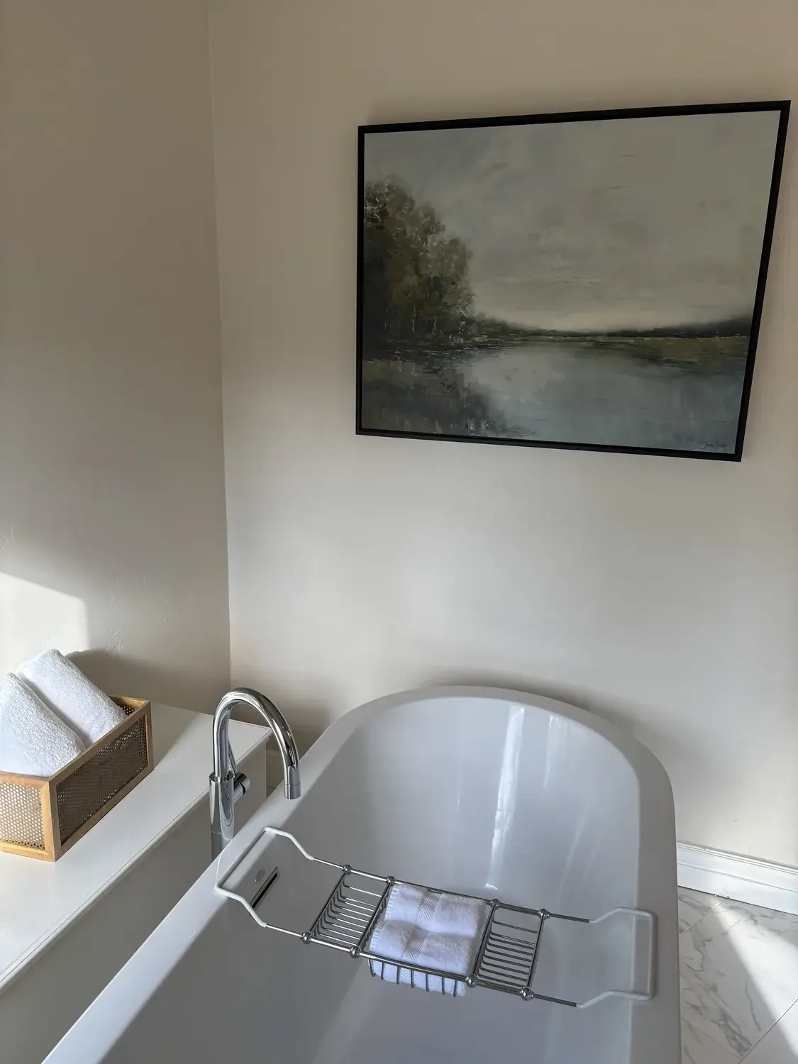
Material Specificity for a Harmonious Look
Authenticity-grade materials
- White oak (rift-sawn), for floors and slat detail; calmer grain than plain-sawn
- Linen fabric, for upholstery and drapery, adding subtle texture and softness
- Matte brass hardware, for fixtures, providing warm, understated accents
- Natural stone (limestone or soapstone), for countertops, offering durability and visual calm
- Muted matte paints, for walls, creating a neutral backdrop
- Woven rattan, for accent furniture or baskets, adding natural texture
- Soft wool rugs, for warmth and layered comfort
- Brushed nickel, for plumbing fixtures, complementing modern hardware
Generic-grade tells we refuse to spec
- Glossy finishes, often too reflective and busy
- Bright white or overly saturated colors, can disrupt harmony
- Synthetic materials, lack warmth and character
- High-gloss metals, overpower softer elements
- Plastic or faux finishes, diminish perceived quality
- Overly patterned fabrics, distract from overall cohesion
- Mass-produced hardware, lack unique character
- Cheap laminates, compromise durability and look
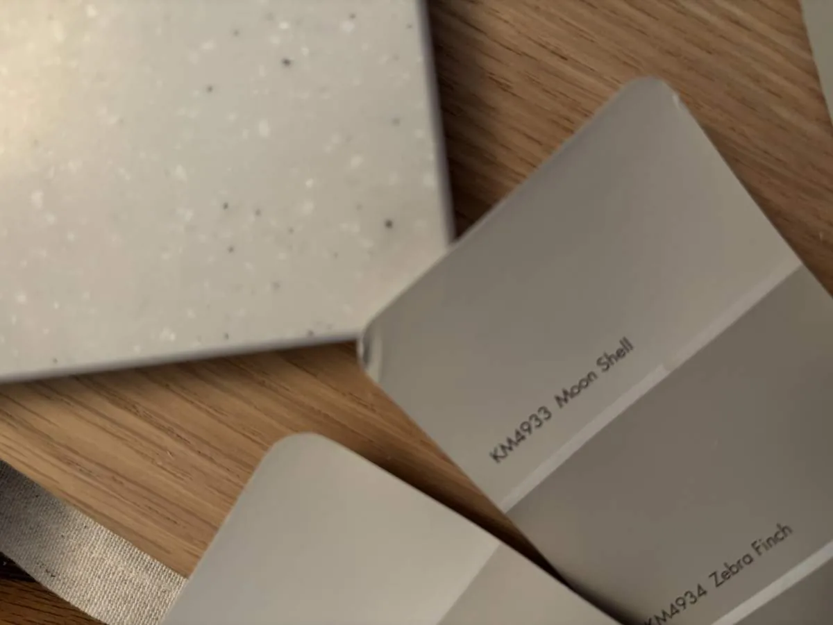
How to Achieve a Balanced and Harmonious Room
The core decision homeowners face is how to create a space that feels unified yet dynamic. The first question we ask is: what is the primary function of the room and who will use it? Basics? Grasp them first. Then consider proportions. Living room furniture must fit well, not too cramped, no odd spaces. We check how pieces connect visually and physically. Nothing should dominate or disappear.
Color ties everything together. Stick to cohesive colors. Use soft neutrals, warm woods. Metal accents? Art pieces? They work. Add texture with rattan, linen, matte. Lighting supports the design. Combining natural light with layers and task lights adds warmth.
Harmony's about choosing carefully. Each piece should enhance the overall space. Use a CRI meter for lighting or cardboard for placement tests. It helps avoid big mistakes.
Choosing the Right Fixtures and Materials for Cohesion
One of the most critical decisions in creating harmony is selecting fixtures and materials that complement each other. Matte brass for the hood complements brushed nickel hardware. The American Society of Interior Designers emphasizes that matching finishes are less important than ensuring materials have a common tone or warmth that supports the overall palette.
Size and scale both count. 36-inch range fits a standard kitchen. A 48-inch range needs a specific hood. Different CFM too. For hood depth, 24 inches minimum. CFM matches cooktop power. Combine stone countertops and matte cabinets, then add woven textures.
Limestone's natural durability beats other materials. They handle Sacramento's weather well, aging gracefully. Harmony stays intact.
Regional Architectural Styles and Their Impact on Harmony
In Sacramento, architectural styles range from historic Victorian and Craftsman homes to modern infill developments. Each style needs a unique harmony. Traditional homes? Layer moldings. Use symmetrical layouts. Warm colors honor history. For modern homes, think clean. Lines should be sharp. Minimal decoration. Stick with one color to highlight materials and proportions.
With older homes, it's about mixing. Keep those original details while adding some updates. Put reclaimed wood beams with modern lights. Feels timeless. In newer homes, aim for simplicity. Keep the palette restrained, match the furniture to the open design.
By tuning into local styles, you make rooms feel real. Sacramento has a mix of architecture so the approach has to fit.
Observed Failure Modes We See in the Field
From our project debriefs and post-occupancy reviews, 2023-2026.
Overloading with Contrasting Elements
One common mistake is adding too many contrasting colors, textures, or styles without a unifying thread. This jumbles the visuals. Mixing too many bright colors or clashing materials? Small spaces can't take it. Feels jumbled. Stick to a main palette. Layer tones and textures instead of clashing. Fewer materials, fewer colors. Everything seems intentional and at ease.
Ignoring Scale and Proportion
Another frequent error is mismatched scale, furniture that is too large or small for the room, or artwork that overwhelms the space. Feels wrong. Just plain awkward. Measure carefully. Furniture has to fit. Make sure furniture matches the room. Get out the tape measure. You avoid costly mistakes and everything fits.
Clutter and Overdecorating
Overdecorating or clutter can quickly ruin harmony by creating visual noise. Messy spaces feel cluttered. Pick accessories carefully. Choose quality over stuffing a room. Keep surfaces free with smart storage. Restraint lets each piece stand out.
Poor Lighting Layering
Relying solely on ceiling-mounted fixtures often leads to flat, uninviting rooms. Layer your lighting from the start. Use soft glows and task lights. Add flare with bold accents. Layered lights add warmth. Include dimmers and natural light. See how light shapes space. Sacramento sunlight needs warm bulb tones. Good balance keeps everything feeling connected. Skipping light layers? Without harmony, designs stumble.
Neglecting Regional Context
Designs that ignore local climate, landscape, and architectural context risk feeling out of place. Sacramento's sunlight can be intense. Old homes around here need materials and colors that fit what the region's all about. Trying cool tones or super modern surfaces in an old-school home? That's a harmony buster. Stick with real materials that fit the area. It ties the inside to the outside, making the place feel right and harmonious.
What's Going Out for 2026
- Overly busy color schemes
- Matching everything exactly
- Ignoring natural light and regional context
- Using synthetic or faux materials
- Overstuffed furniture or clutter
- High contrast finishes that clash
- Ignoring scale and proportion
- Overly trendy or fast-fix styles
- Poor lighting layering
- Disregarding architectural details
- Neglecting texture variety
- Choosing finishes without regional consideration
What This Costs in 2026
| Scope | Typical range |
|---|---|
| Refresh scope with minor updates | $30K-$75K |
| Mid-tier renovation | $100K-$300K |
| Estate-scale overhaul | $400K-$1.2M |
Working Notes
What We Have Learned Doing This: The 7 Principles of Interior Design: Harmony
“A decision made late costs three times the same decision made early.”
Order the long-lead items before anything else and design the sequence so the rest of the job can proceed without them. The appliance, the stone, the custom millwork set the schedule, and pretending otherwise is how a project loses a month it never gets back.
The cheapest tool on any project is a sample board and an afternoon. We have watched five-figure mistakes get caught by a fifteen-dollar paint sample lived with for a week in the actual light of the actual room. Decisions made under showroom lighting do not survive contact with a real house.
Old houses lie, and so do new ones. Even newer homes can mislead. We trust old plans even less now. The budget needs a real line for what demolition will uncover, usually 15 to 20 percent once walls start opening.
These notes come from our own project debriefs. Most were learned the expensive way the first time.
Sources & Professional References
This guide's positions on materials are grounded in published building-code, standards, and recognized design-authority sources, alongside Designed | Curated Interiors' verified credentials and active project files:
- American Society of Interior Designers (ASID): interior-design practice standards
- International Code Council (ICC): Chapter 8 Interior Finish Decorative Materials And Furnishings
- NKBA, Amy Kunst Member Profile (verified credential, NKBA Committee Member)
- Featured in: Homes & Gardens (design expert quote, May 2026) · Sacramento Love (guest author, 2024)
From Principle to a Real Room
A trend piece is the briefing document, not the deliverable. The pages below show how we translate these principles into finished rooms across Sacramento and the rest of Northern California.
- Sacramento & Bay Area Interior Design Services How we scope, source, and deliver work end to end.
- Interior Designer Hub, Sacramento Where most of our Sacramento work lives, the regional fit explained.
- Modern Tudor Homes: Authentic, Revival, and Neo-Tudor (A Designer Reference) Heritage-architecture renovation patterns from our project files.
- Japandi Living Room: A Designer's Guide to the 2026 Look The 2026 warm-neutral playbook applied to the living room.
Part of our design fundamentals series. Harmony is one of the core principles of interior design. See the complete guide to the principles of interior design, and how the elements of interior design put them to work together.