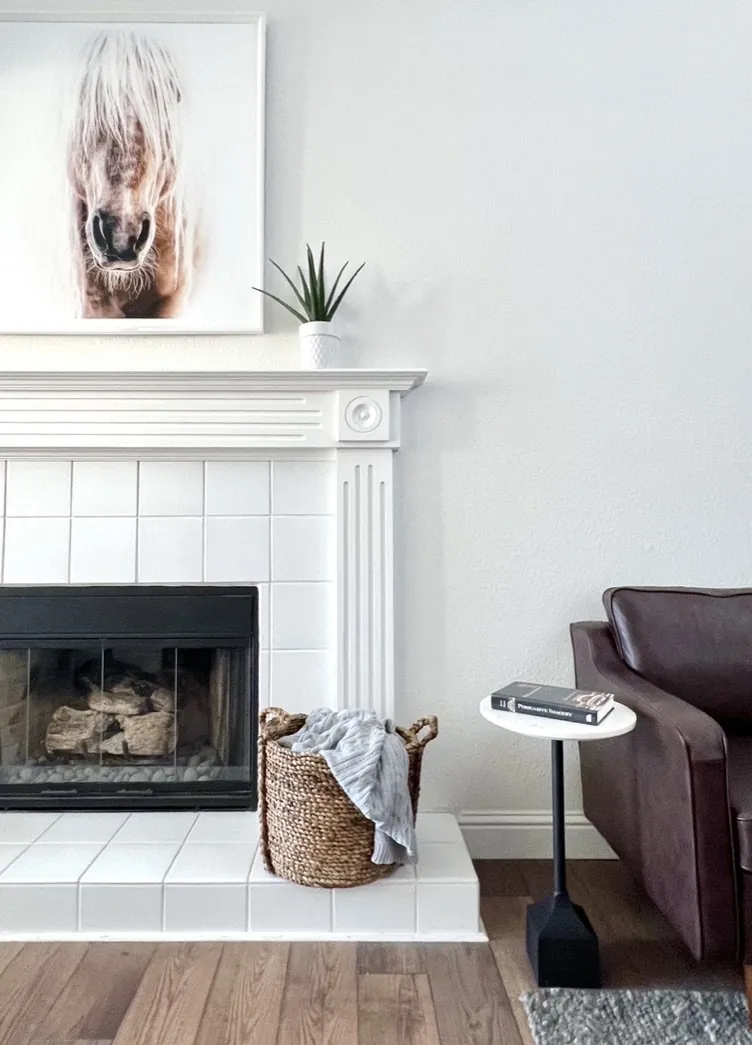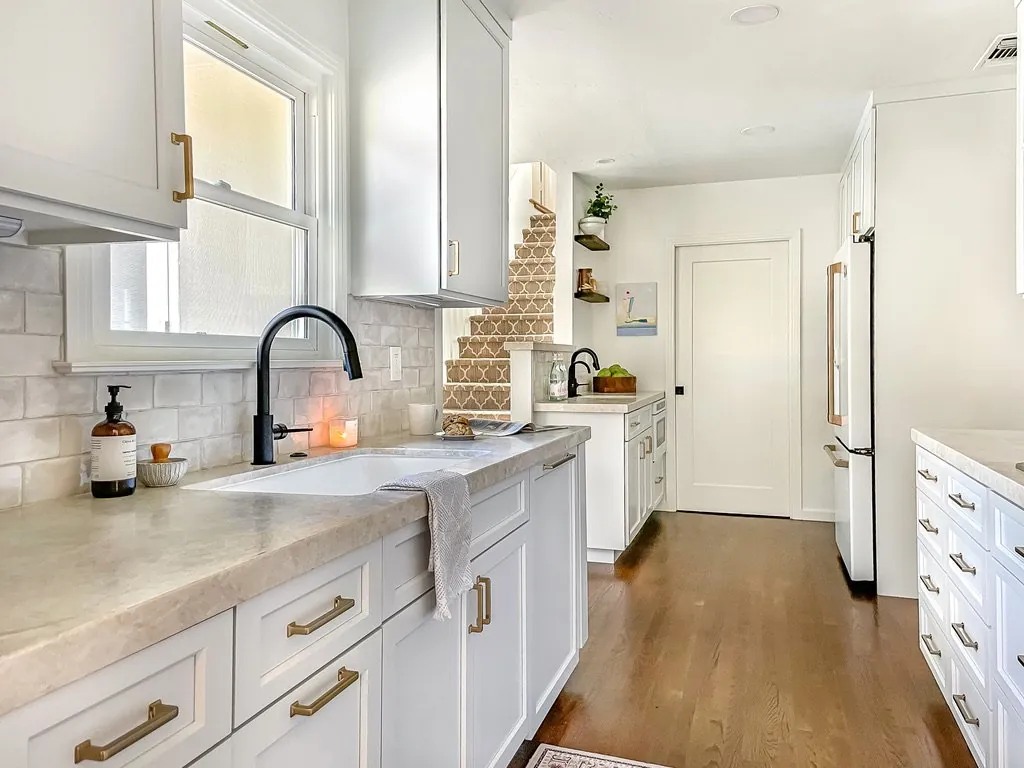
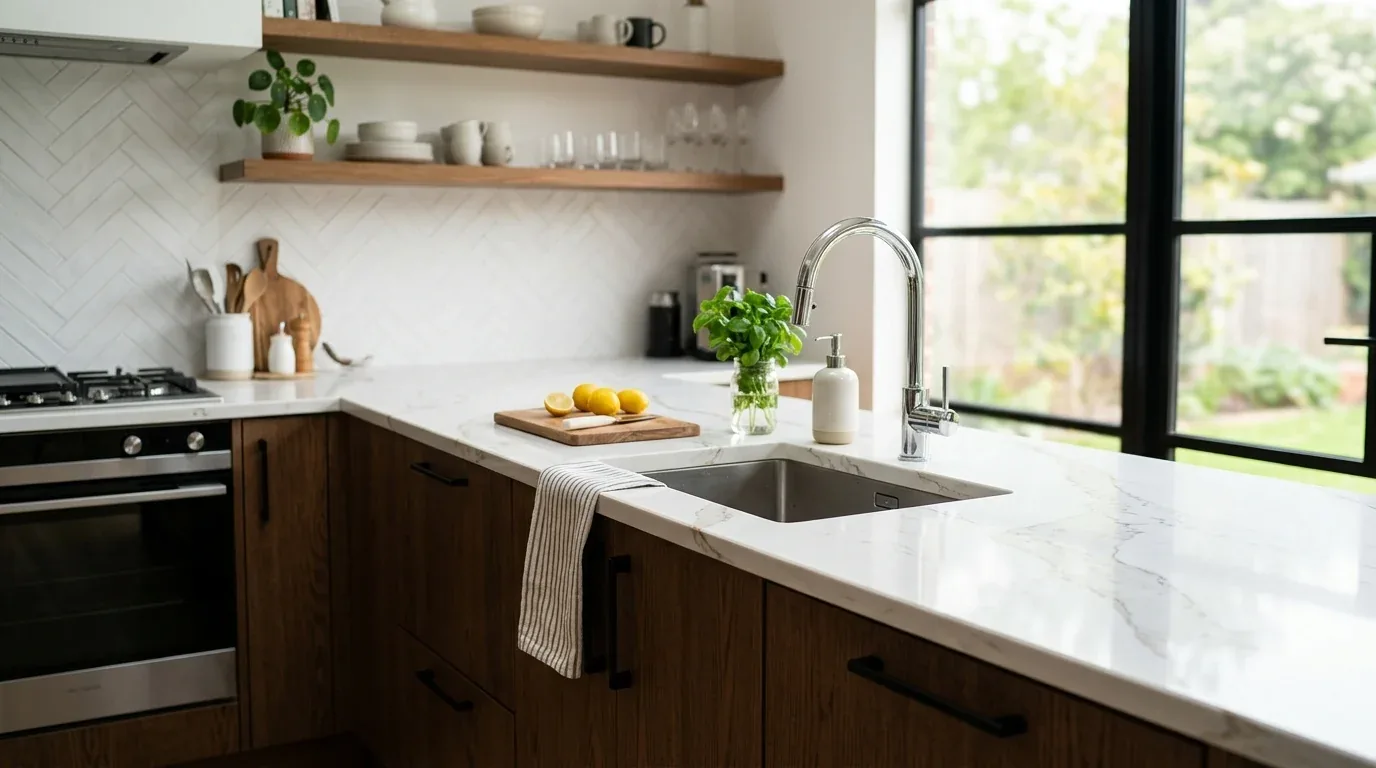
Contrast makes rooms pop. It highlights what's different, like a bold wall color beside a pale one. Use contrast to guide the eye. It can make a room both beautiful and practical. Balance contrast carefully. Too much can overwhelm.
This post digs into using contrast while keeping spaces inviting. We'll dig into contrast types, where it fits, and how it sets tones. In Sacramento, we're all about blending modern with the city's classic architecture.
Common Questions
| What is the role of contrast in interior design? | Bring focus using color or texture. |
| How can contrast be used effectively in Sacramento homes? | In Sacramento, consider the city's style. Mix bold with cozy. |
| What are some common types of contrast used in interior design? | Experiment with color and texture for depth. |
| When should I consider using contrast to highlight architectural features? | Contrast can spotlight features like moldings in old homes. |
Using Contrast to Create Visual Hierarchy and Interest
In our projects across Sacramento, effective contrast begins with understanding how different elements interact to guide the viewer’s eye. Black cabinets meet oak floors. It's bold but ties the room together. We often specify materials like cement tile with smooth plaster walls to add tactile contrast, or use rectilinear furniture against organic shapes to introduce visual tension.
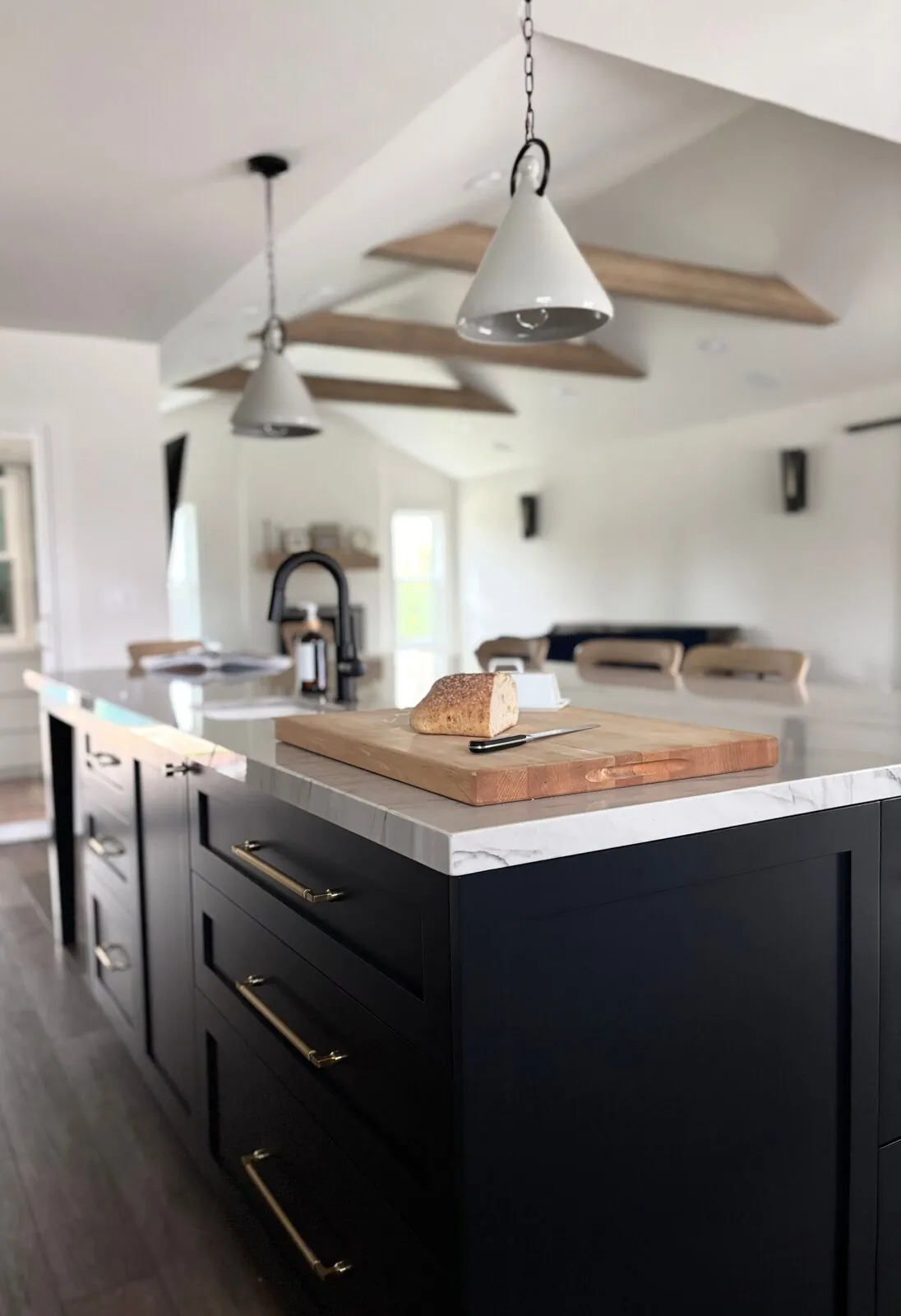
Make contrast work for you. It should highlight or organize without causing clutter. Imagine a kitchen island in white marble paired with dark cabinets. The contrast draws the eye. In smaller spaces, mix bold contrasts with subtle elements.
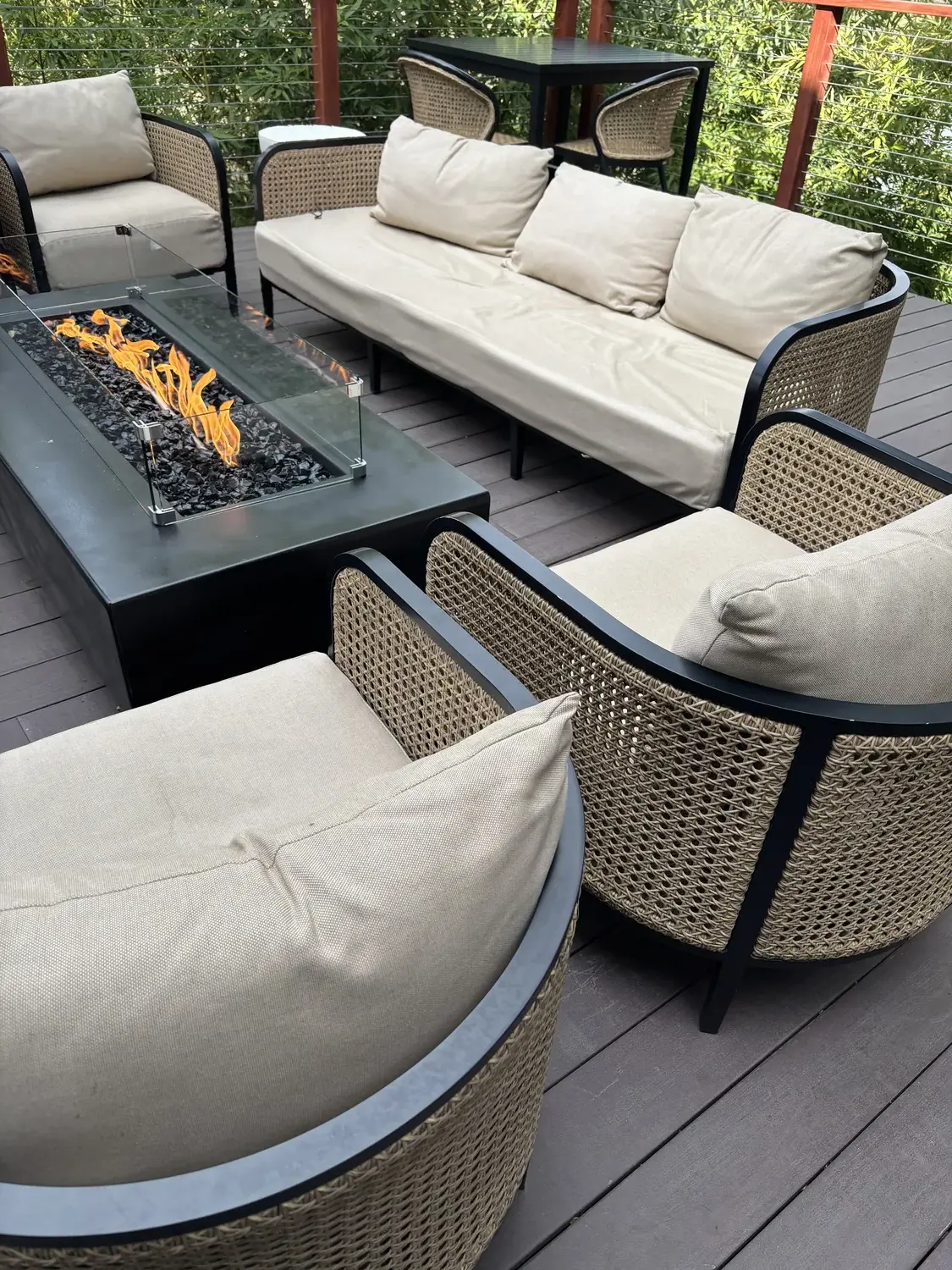
Material Specificity in Contrast: Authentic Choices for Lasting Impact
Authenticity-grade materials
- White oak (rift-sawn), for floors and slat detail; calmer grain than plain-sawn
- Matte black hardware, for a subtle, modern contrast that ages well
- Textured plaster, adds tactile variation and warmth
- Polished concrete, creates sleek contrast with softer materials
- Brushed brass fixtures, warm metallic contrast that complements cool tones
- Rift-sawn walnut, for cabinetry and furniture with consistent grain
- Matte porcelain tiles, for a muted, durable surface
- Natural linen fabric, adds soft contrast to smooth surfaces
Generic-grade tells we refuse to spec
- Mass-produced laminates, lack authenticity and character
- Glossy finishes, can feel cold and reflect too much light
- Synthetic textiles, less durable and authentic
- Overly uniform materials, reduce visual interest
- Cheap hardware, tarnishes quickly
- Vinyl flooring, less sustainable and less genuine
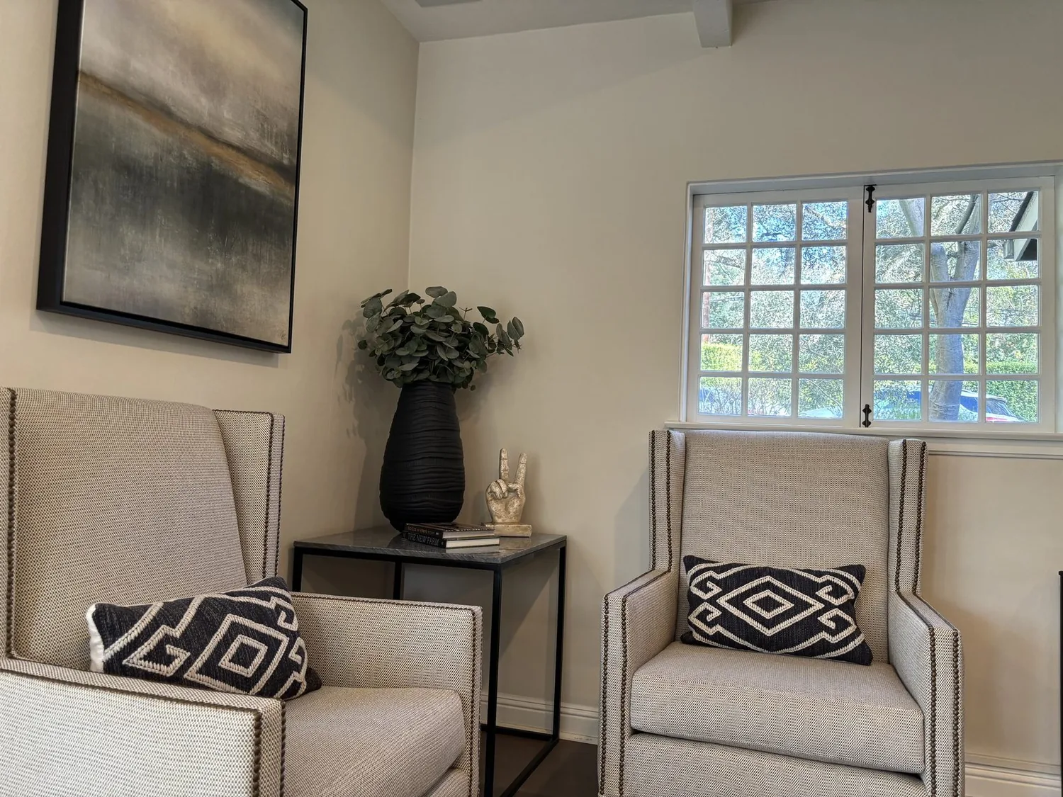
Should You Remodel or Rebuild in Sacramento?
Remodel or rebuild? Depends on the building's current state and what you want. To use contrast well, know the size and limits. The first question we ask is: what is the primary goal, updating style, improving function, or expanding space? In Sacramento’s older neighborhoods, many homes have good bones but lack the visual interest that contrast can bring.
Picture using black accents in the living room with white walls. Stick to a sturdy frame and switch up paint and fabric. Gives it new life. Cheaper than a full teardown. A bad layout or severe structural flaws? Rebuilding often makes sense then. Bring a tape measure, snap photos, check permits, helps avoid mistakes that drain budgets. Sacramento demands respect for character. Historic districts meet careful contrast.
How to Use Contrast to Highlight Architectural Features
Highlighting architectural features through contrast is one of the most effective ways to add depth and personality to a space. The first question we ask is: which features are worth emphasizing? Paint crown moldings navy or try a satin finish on beams. Sacramento homes love that detail.
Try a darker trim than walls. Makes moldings pop. We went with matte black for window frames, offset by soft white walls. That contrast feels modern yet inviting. Watch contrast; too much can jar, especially in tight or low-ceiling spaces. Texture meets smooth surfaces. It draws the eye but doesn’t overwhelm. This works with Sacramento's range of home styles and adds a modern touch.
Common Mistakes to Avoid When Incorporating Contrast
One of the most frequent mistakes we see is overdoing contrast, which can create a chaotic or disjointed space. Overusing contrast? Total eyestrain. Don’t skip lighting. Contrast won’t work without it. Contrast needs light. Otherwise, colors and textures fall flat. Too much contrast now means expensive changes later.
Balance bold and neutral tones, light them well. No pitfalls then. Consider the style. What fits a Sacramento loft won’t suit a Craftsman. Mockups matter. They prevent costly mistakes.
Observed Failure Modes We See in the Field
From our project debriefs and post-occupancy reviews, 2023-2026.
Overwhelming Contrast
Using too many contrasting elements without moderation can make a space feel chaotic and uncomfortable. Too much contrast kills room flow. Leads to a messy look, makes folks uneasy. Pick a couple of standout pieces with contrast, then go neutral elsewhere. Sacramento homes need restraint. Keeps it lively with the original vibe.
Ignoring Scale and Proportion
Applying high-contrast finishes or furnishings that are disproportionate to the space can make a room feel smaller or unbalanced. A small room with a big dark wall? That can feel like walking into a cave. Proportions gone wrong? They just clash visually. Measure twice, mockup once. That’s the way to make sure contrast works without overwhelming the space. Painter's tape and light meters are handy. Balances and keeps room in check.
Poor Lighting Choices
Contrast relies heavily on proper lighting; inadequate or inappropriate lighting can flatten contrast or make it appear harsh. Flat or chilly space? Probably lacking layers. Add layers to the lighting. It should highlight textures and colors without any harsh shadows. Natural light changes with the season here in Sacramento. Plan your lighting for coziness.
Choosing Contrasts That Clash with Style
Contrasts that do not align with the overall design style can feel out of place. That sofa with an industrial table? Might clash. But do it with intention, and it works. Pick contrast elements that suit your style. Whether modern or eclectic, match it to the feel. Keeping the style consistent makes contrast feel purposeful.
What's Going Out for 2026
- Using too many contrasting colors in one room
- Applying high-gloss finishes with matte textures indiscriminately
- Ignoring the room’s natural light when choosing contrast
- Overly busy patterns that clash
- Contrasts that overpower architectural details
- Excessive scale differences that confuse the eye
- Neglecting harmony in favor of boldness
- Choosing contrast without considering long-term maintenance
What This Costs in 2026
| Scope | Typical range |
|---|---|
| Refresh scope: new paint, minor texture tweaks | $12K-$20K |
| Mid-tier scope: new finishes, custom textiles, accent features | $35K-$75K |
| Estate-scale: complete overhaul with high-end materials and custom millwork | $100K-$300K |
Working Notes
What We Have Learned Doing This: The 7 Principles of Interior Design: Contrast
“A finish you cannot maintain is a finish you cannot afford.”
A renovation is a dependency chain, not a list of tasks. A two-day cabinet delay quietly becomes a two-week slip by week sixteen because every trade downstream is holding a calendar. The least glamorous part of this work, and the most valuable, is keeping that chain from cascading.
Most of the money that gets wasted is spent solving the wrong problem confidently. A homeowner asks for more space, every contractor agrees and prices an addition, and the real issue turns out to be light, or proportion, or one bad sightline. We make the room tell us the problem before anyone signs a demolition contract.
Specify for the next ten years, not the next photo shoot. The work that holds its value is quiet, well made, and a little bit boring on the day it is installed.
These notes come from our own project debriefs. Most were learned the expensive way the first time.
Sources & Professional References
This guide's positions on materials are grounded in published building-code, standards, and recognized design-authority sources, alongside Designed | Curated Interiors' verified credentials and active project files:
- American Society of Interior Designers (ASID): interior-design practice standards
- International Code Council (ICC): Chapter 8 Interior Finish Decorative Materials And Furnishings
- NKBA, Amy Kunst Member Profile (verified credential, NKBA Committee Member)
- Featured in: Homes & Gardens (design expert quote, May 2026) · Sacramento Love (guest author, 2024)
From Principle to a Real Room
A trend piece is the briefing document, not the deliverable. The pages below show how we translate these principles into finished rooms across Sacramento and the rest of Northern California.
- Sacramento & Bay Area Interior Design Services How we scope, source, and deliver work end to end.
- Interior Designer Hub, Sacramento Where most of our Sacramento work lives, the regional fit explained.
- Modern Tudor Homes: Authentic, Revival, and Neo-Tudor (A Designer Reference) Heritage-architecture renovation patterns from our project files.
- Japandi Living Room: A Designer's Guide to the 2026 Look The 2026 warm-neutral playbook applied to the living room.
Part of our design fundamentals series. Contrast is one of the core principles of interior design. See the complete guide to the principles of interior design, and how the elements of interior design put them to work together.