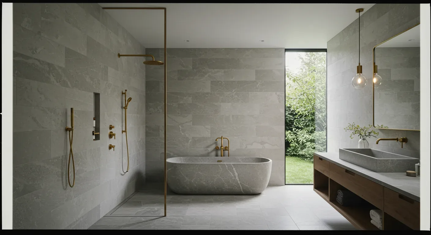
Color shapes how a room feels and works. Essential. Know how colors clash or mesh with furniture.
Bold vs. chill in 2026 design. Keep spaces nice and personal, colors support vibes.
Learn how colors alter moods, from zen to energetic. Tips, real examples included. See how trends fit in current spaces. Highlight with colors smartly. As always, our approach emphasizes a warm-restraint perspective that respects Sacramento’s architectural fabric and natural light, ensuring timeless yet contemporary interiors.
Common Questions
| What role does color play in interior design? | Color directly influences mood and perception in a space—cool tones like greige or soft blues create calm, while warm terracottas or deep greens add energy. For example, a 2018 NKBA study found that 85% of homeowners associate soft neutrals with relaxation, but that shifts in high-traffic areas where durability matters. Always tie color to the room’s function: a home office in Sacramento’s bright light needs high-LRV paints to avoid glare, while a library benefits from warm, low-glare hues to reduce eye strain. |
| How can I choose the right color palette for my Sacramento home? | Start with your home’s existing light conditions—measure natural light exposure (use a lux meter or phone app) and note artificial sources. For instance, a south-facing room in Sacramento gets harsh midday sun, so a matte eggshell in *Benjamin Moore’s* *Chantilly Lace* (OC-65) will hide imperfections better than a flat finish. Test paint samples on large sheets of cardboard under all lighting conditions, including overhead and task lighting, for at least 48 hours. And don’t ignore the existing style: a Craftsman home’s built-ins demand earthy tones, while a mid-century modern’s clean lines can handle bold jewel tones if the rest of the palette is neutral. |
| What colors are recommended for making rooms feel larger? | Light, saturated colors—like *Sherwin-Williams’* *Alabaster* (SW 7008) or *Pure White* (SW 7005)—visually expand space by reflecting more light, but only if the room has adequate lighting (aim for 300+ lux in living areas). Mirrors amplify this effect, but their placement matters: avoid reflecting heat sources (like fireplaces) or cluttered walls. For small Sacramento homes, stick to a single color family across walls, trim, and ceilings (a technique called *monochromatic layering*) to create cohesion without visual weight. And skip dark accents—they shrink perceived volume faster than you’d think. |
| Why is understanding natural light important when selecting interior colors? | Natural light shifts color temperature and intensity throughout the day, and Sacramento’s mix of overcast and sunny days makes this critical. A color that looks warm in the morning (like *Farrow & Ball’s* *Setting Plaster* in a north-facing room) can appear grayish by afternoon. Use a color wheel app to adjust hues based on your home’s orientation: north rooms benefit from warm undertones, while south rooms need cooler, high-LRV paints to prevent fading. And don’t trust the paint chip under store lighting—always test in situ, especially near windows where UV exposure accelerates degradation. |
Using Color to Shape Mood and Atmosphere
In 2026, the most impactful design move is leveraging color to craft the desired mood within a space. Terracotta adds warmth. Great for bedrooms. Soft blues calm you down. Nice in bathrooms. Right color changes feel of a room. No reno needed.
What feel do you want? Colors can help. The American Society of Interior Designers emphasizes that color psychology is a powerful tool for creating spaces that support well-being. Want calm? Use green. Go yellow when you need energy. Balance color with light and furniture to keep it smooth.
Material Specificity for Color Application
Authenticity-grade materials
- White oak (rift-sawn), for floors and slat detail; calmer grain than plain-sawn
- Linen fabric, for upholstery; soft, muted tones enhance understated elegance
- Matte ceramic tiles, in kitchens and baths; reduce glare and enhance color depth
- Silk wallcoverings, for focal walls; subtle sheen adds richness
- Natural limestone, for fireplace surrounds; warm, earthy tones complement Sacramento’s landscape
- Acrylic paint, for walls; durable, low VOC options in soft neutrals and pastels
- Brushed nickel hardware, for fixtures; complements matte and satin finishes
- Reclaimed wood, for accent furniture; adds texture and authenticity
Generic-grade tells we refuse to spec
- Standard matte paint, often overused, lacks depth
- Synthetic fabrics, may not age well or match authentic materials
- Glossy ceramic tiles, can create glare and harsh reflections
- Overly processed veneers, lack natural texture
- Plastic hardware, cheap appearance and poor longevity
- Mass-produced wood, less character and warmth
How to Choose a Color Palette That Complements Your Design Style
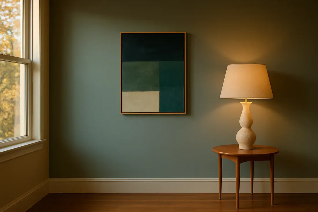
The core decision many homeowners face is selecting a color palette that aligns with their overall design style and personal taste. We kick things off by asking: is this space meant for calm, energy, or a classy feel? Modern designs like neutrals with soft contrasts. Deep jewel tones fit classic themes.
Architectural details and current materials matter. In Sacramento houses with natural wood finishes, you need colors that complement, not clash. We suggest palettes based on materials and light, balancing trendy with timeless. Current trends show soft muted or earthy shades can refresh a space.
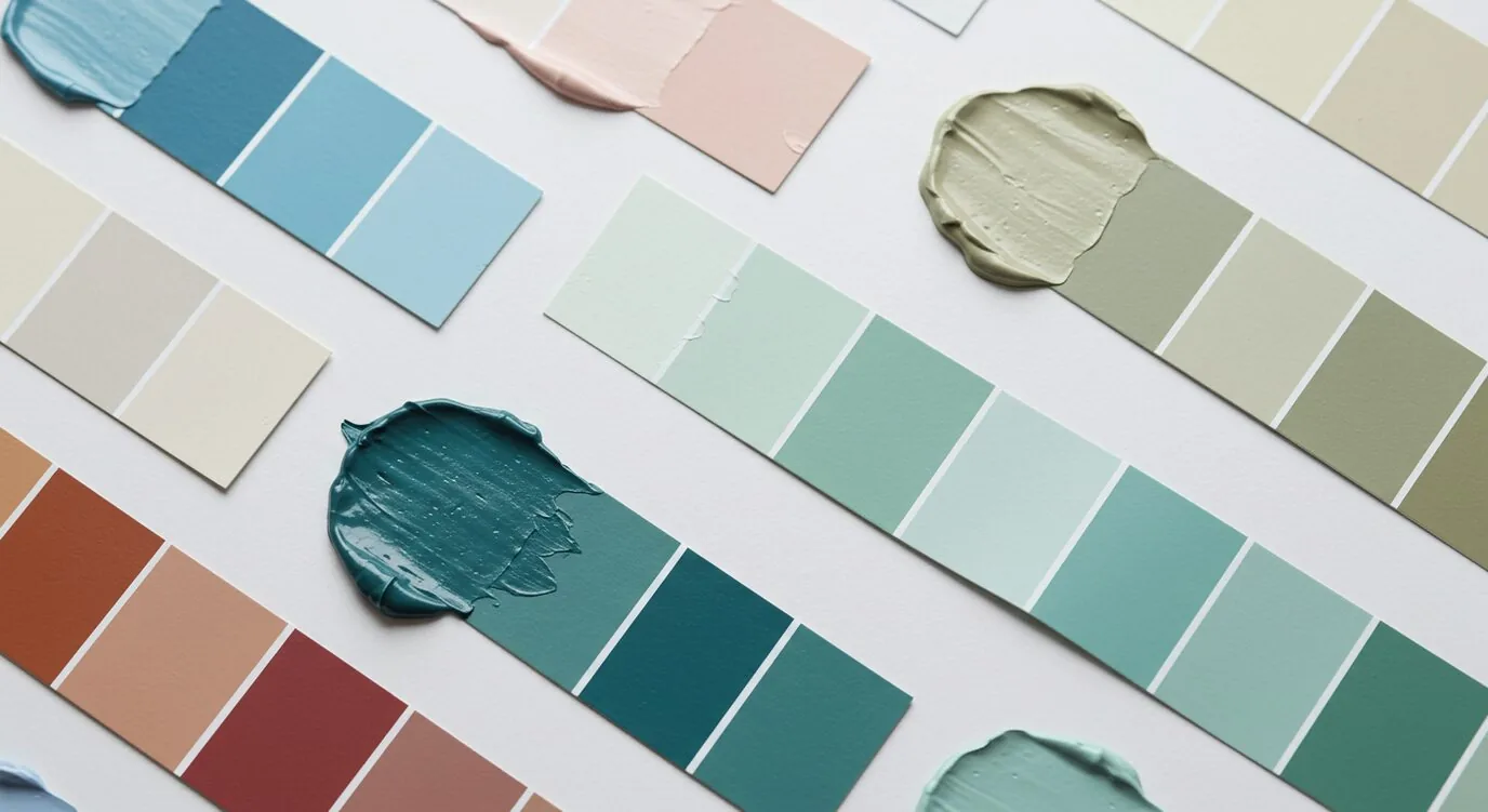
Make a mood board. Grab fabric swatches and paint samples. A visual plan keeps colors harmonious. Avoid costly mistakes. The goal? Your style needs a matching palette.
Using Color to Make a Room Feel Larger or Cozier
One of the most common high-stakes decisions is how to manipulate space perception through color. Do you want a room that feels bigger or one that's a cozy hideaway? Pale whites and grays make a room feel larger. Great for small dark spaces.
Dark blues or charcoals create a cozy atmosphere. Try shades in a monochrome style, maybe use darker tones on one wall. In Sacramento, lack of sunlight makes color choice crucial.
Recent projects show light walls with warm textures create a welcoming atmosphere. Test colors right on the wall. Watch how they shift as light changes, especially in variable sun areas.
Incorporating Color Trends into Existing Home Decor
Integrating new color trends into an established interior can be a challenge, especially when aiming for a cohesive look. Homeowners often ask: how do you update colors without a total redo? We like adding trendy colors as accents. Add soft sage or warm terracotta to update neutrals.
Match colors with existing furniture. In Sacramento's older areas, using trendy paint freshens a room while respecting its history. Switch up curtains or pillows now and then. No painting required.
Pair fresh colors with your usual grays. Prevents the room from feeling outdated. Combine colors carefully for a balanced look. Matches the Sacramento style.
Creating Focal Points or Accent Areas with Color
One of the most effective ways to add visual interest is through strategic use of color in focal or accent areas. Plan where the eye should land. Should it be a unique feature? Decide if the focus is a wall, chair, or piece of art. Bright oranges or deep blues stand out as accents.
For many Sacramento homes, a bold color wall behind the fireplace catches attention. The American Society of Interior Designers notes that contrast and saturation are key tools for this purpose. Add color with fixtures or cabinet accents.
Your accent color will look different in each lighting condition. Test paint in various lights. Notice changes in lighting throughout the day.
Observed Failure Modes We See in the Field
From our project debriefs and post-occupancy reviews, 2023-2026.
Overusing Bright Colors in Small Spaces
Many homeowners believe that bold colors will energize a space, but in smaller rooms they often lead to a feeling of clutter or overstimulation. Overusing bright colors makes a space feel tight. Match bold colors with calm ones. It keeps the room from feeling crowded. Check your paint choices under different lights to keep the room feeling settled.
Ignoring Natural Light When Choosing Colors
Natural light dramatically affects how colors appear in a space. Many homes here see sunlight shift, which changes how colors look. Sample chips aren’t enough. Check how your room's light affects color choices first. Test samples in daylight and evening. Unsure? Use a light meter. This way, colors enhance without causing glare.
Clashing Colors in Open-Plan Spaces
In open-concept interiors, using conflicting color schemes in adjacent zones can create visual discord. Skipping flow and transition makes bold colors clash. Ensure a smooth transition between rooms with simple color tweaks or matching shades. Tying designs with gradients keeps room character intact.
Choosing Trend Colors Without Long-Term Viability
Following every fleeting trend without considering longevity can result in a space that feels outdated quickly. Trendy shades should suit your home, not just be fashionable. Test trendy shades in small doses first. Accessories work well. Using neutral classics with trendy accents keeps Sacramento homes stylish.
Overlooking the Impact of Texture and Finish
Color is not just about hue but also about finish and texture. Gloss or matte finishes change light reflection on colors. Picking a color? The finish will change how it looks and feels. Matte walls seem soft and muted. Glossy ones? Much more intense. Match finish to room use and light for a polished look.
What's Going Out for 2026
- Overly dark or heavy palettes in small rooms
- Clashing colors in open plans
- Ignoring natural light effects
- Using trend colors as the main scheme
- Bright colors without balance or context
- Overcomplicating color schemes
- Neglecting texture and finish impact
- Choosing colors in isolation from materials
What This Costs in 2026
| Scope | Typical range |
|---|---|
| Refresh scope | $5K-$12K |
| Mid-tier scope | $12K-$35K |
| Estate-scale | $35K-$100K |
Working Notes
What We Have Learned Doing This: The 7 Elements of Interior Design: Color
“If a color is named in three magazines this year, it will date faster than its lifespan. Choose colors that have looked tasteful for twenty years.”
The safest paint decision is the one made last, against the finished floors and the real light, not first against a white wall.
A renovation is a dependency chain, not a list of tasks. A two-day cabinet delay quietly becomes a two-week slip by week sixteen because every trade downstream is holding a calendar. The least glamorous part of this work, and the most valuable, is keeping that chain from cascading.
Old houses lie, and so do new ones. Even a ten-year-old house lies the moment you assume the framing sits where the plans say. We stopped trusting old drawings, prior contractor work, and the phrase it should be fine a long time ago. The budget needs a real line for what demolition will uncover, usually 15 to 20 percent once walls start opening.
The cheapest tool on any project is a sample board and an afternoon. We have watched five-figure mistakes get caught by a fifteen-dollar paint sample lived with for a week in the actual light of the actual room. Decisions made under showroom lighting do not survive contact with a real house.
These notes come from our own project debriefs. Most were learned the expensive way the first time.
Sources & Professional References
This guide's positions on materials are grounded in published building-code, standards, and recognized design-authority sources, alongside Designed | Curated Interiors' verified credentials and active project files:
- American Society of Interior Designers (ASID): interior-design practice standards
- International Code Council (ICC): Chapter 8 Interior Finish Decorative Materials And Furnishings
- NKBA, Amy Kunst Member Profile (verified credential, NKBA Committee Member)
- Featured in: Homes & Gardens (design expert quote, May 2026) · Sacramento Love (guest author, 2024)
From Principle to a Real Room
A trend piece is the briefing document, not the deliverable. The pages below show how we translate these principles into finished rooms across Sacramento and the rest of Northern California.
- Sacramento & Bay Area Interior Design Services How we scope, source, and deliver work end to end.
- Interior Designer Hub, Sacramento Where most of our Sacramento work lives, the regional fit explained.
- Modern Tudor Homes: Authentic, Revival, and Neo-Tudor (A Designer Reference) Heritage-architecture renovation patterns from our project files.
- Japandi Living Room: A Designer's Guide to the 2026 Look The 2026 warm-neutral playbook applied to the living room.
Part of our design fundamentals series. Color is one of the seven elements of interior design. See the complete guide to the elements of interior design, and how the principles of interior design put them to work together.