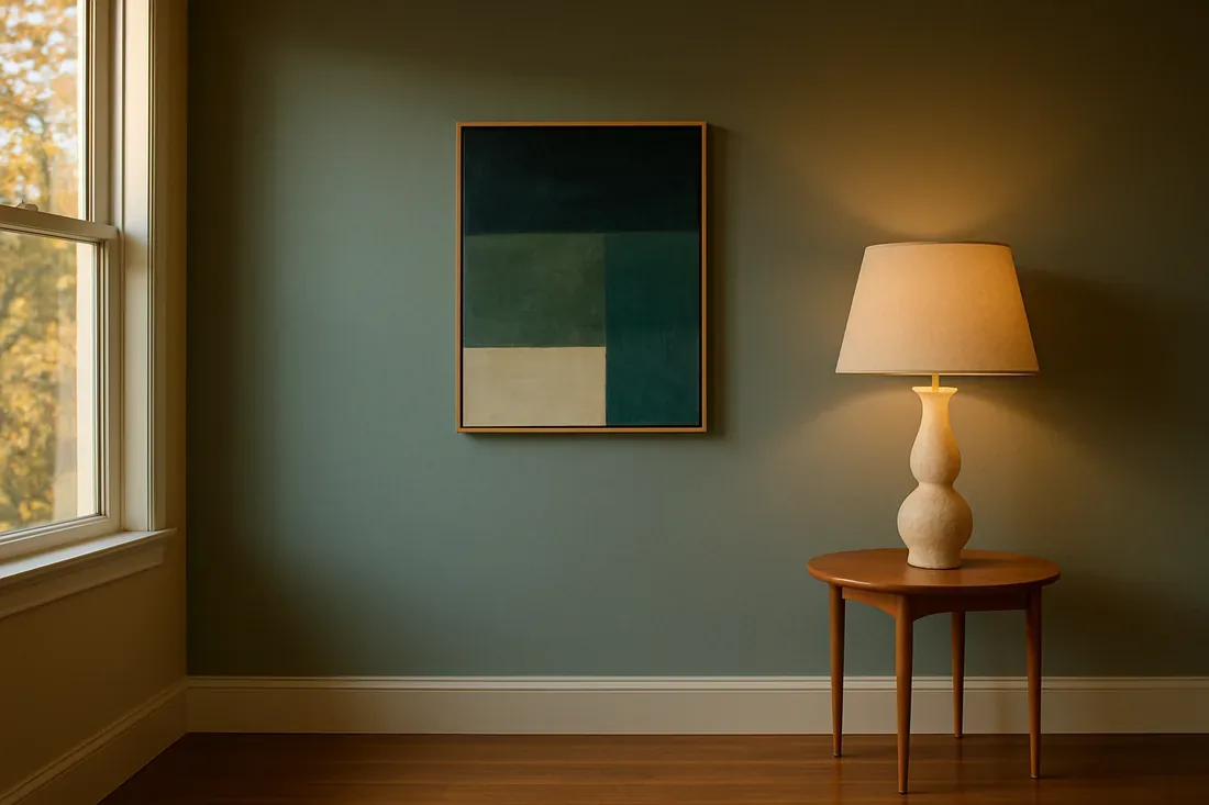
Pairing colors with green can shape a room's balance. Keep green central, avoid clashes. By 2026, you’ll want specific neutrals with green, big impact. Look for how light affects these colors too. We aim for a warm, restrained look that suits Sacramento homes. Color choices make rooms feel classic and fresh. We'll talk about color matches, material choices, and tips for green-centered interiors.
Direct Answers (What Colors Go With Green)
| What colors go well with green in interior design? | Beige or taupe alongside green feels balanced. |
| How can I incorporate warm hues with green? | Use mustard yellow in pillows. It perks up without taking over. |
| Are there regional considerations for pairing colors with green in Sacramento? | Sacramento loves earthy greens, warm neutrals. They echo local history. |
| What role does lighting play in pairing colors with green? | Natural light here shifts colors. Makes greens and warms pop. |
First Major Design Move: Balancing Green with Neutrals and Warm Tones
When greens meet the right neutrals, magic happens. Warm beige walls? They let greens pop. Sherwin-Williams Alabaster on walls with an emerald sofa works wonders. These neutrals hold up well in older local homes. Warm touches like yellow or orange add energy. Suggesting Benjamin Moore's Pumpkin Spice for accents often. Add these colors in art. Keeps things lively. Sacramento's light accentuates subtle color changes and livens up spaces.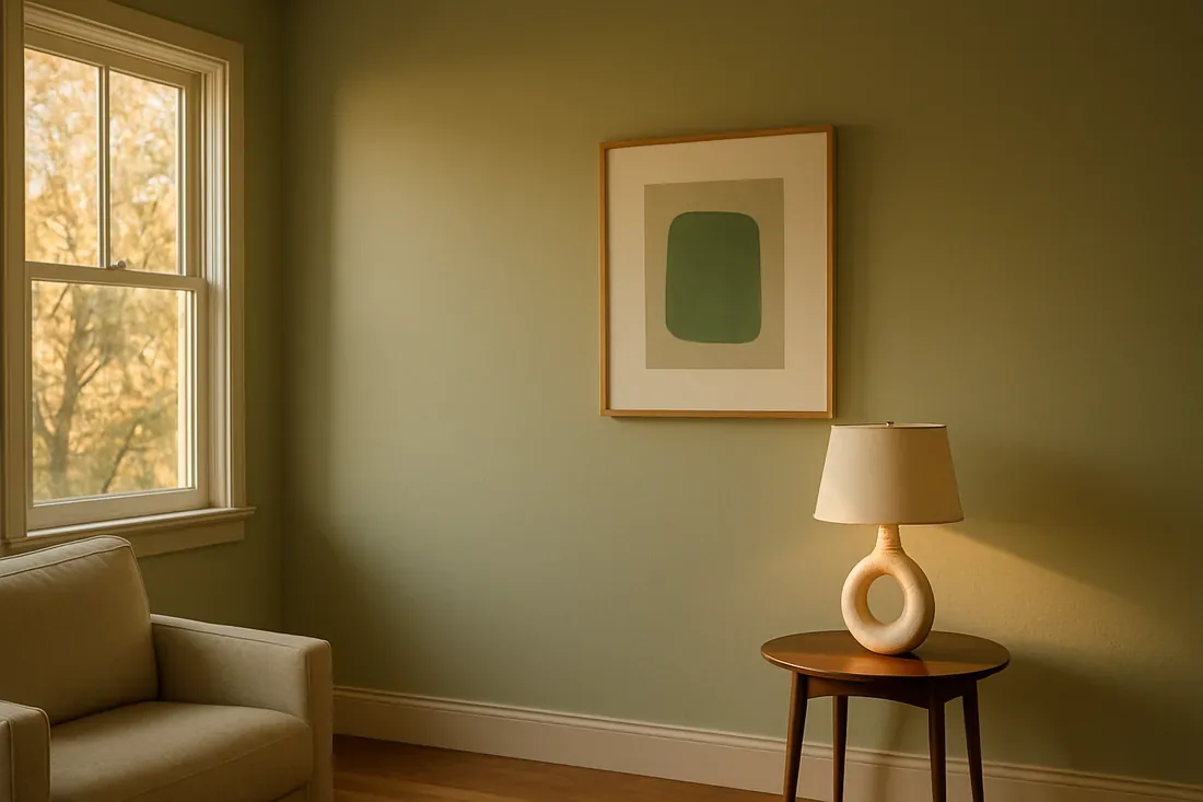
Material Specificity: Choosing Authentic and Practical Materials for Green Pairings
Authenticity-grade materials
- White oak (rift-sawn), for floors and slat detail; calmer grain than plain-sawn
- Linen fabric, for upholstery and drapery, adds softness and texture
- Matte ceramic tiles, for backsplashes, durable and understated
- Bronze hardware, warm metal that complements green tones
- Natural stone (limestone or travertine), for countertops and accents, regional and timeless
- Muted wool rugs, for grounding the space without competing with wall colors
- Soft matte paint, for walls to prevent glare and enhance subtle hues
- Glass and acrylic, for modern accents that reflect light
- Cork flooring, sustainable, warm, and regional in feel
Generic-grade tells we refuse to spec
- High-gloss finishes, tend to clash with muted green tones
- Plastic or synthetic fabrics, lack authenticity and aging gracefully
- Brightly colored tiles, can overpower subtle green shades
- Chrome hardware, too cold for warm greens
- Laminates, less durable and less regionally appropriate
- Synthetic rugs, tend to look cheap and wear quickly
- Glossy paint, can create glare and highlight imperfections
- Mass-produced cabinetry, less character and regional appeal
Designer Decision Matrix: Which What Colors Go With Green Approach Fits Your Home
How we actually decide: match your situation to what we would specify, and the reasoning behind it.
| Your Goal | Best Solution | Why We Recommend It |
|---|---|---|
| Create a timeless Sacramento interior with regional charm | Use muted, regional greens paired with warm neutrals | This combination respects the region’s architectural stock and indoor-outdoor lifestyle, ensuring longevity and regional appropriateness. |
| Maximize a small space | Choose light, reflective greens with neutral walls | Light colors and strategic use of reflective surfaces make rooms feel larger, crucial in older Sacramento homes with lower ceilings. |
| Achieve a luxury finish in a high-end remodel | Incorporate deep emeralds with matte gold accents | Rich greens and golds elevate the space, aligning with Sacramento’s upscale neighborhoods and regional preference for understated luxury. |
| Modernize a pre-war Sacramento home | Opt for soft sage greens with contemporary materials | Soft greens blend well with the region’s historic architecture while providing a fresh, current feel that appeals to regional buyers. |

How to Select the Right Neutral and Warm Colors for Green Interiors
Balancing green in your interiors can seem daunting. Just mix in subdued taupe for contrast. We start with the neutrals. Which shades won't make it too loud or too bland? I've found warm neutrals work wonders. Beige or taupe sets a stage for any green, from olive to emerald. In Sacramento, neutrals shrug off yellowing. They endure well.Warm accents matter a lot. Mustard yellow or burnt orange can brighten the room without fighting the greens. Keep them minimal. A pillow or art piece will do, maybe a table. Let them highlight, not take over, your greens. Sacramento light shifts everything. How colors show depends on it. Sun makes warm tones pop, but softer lights keep them gentle. Find a balance that gives energy yet feels grounded. Aim for a timeless design that fits Sacramento's feel.
How Different Shades of Green Affect Pairing Choices
Olive brings depth and suits urban Cement Flats homes, while mint offers a light vibe and is great for smaller spaces like those seen in Oak Park. Every shade has a story, a perfect partner. Olive green, earthy, goes well with rich neutrals and rust. It suits traditional or rustic places here. Emerald green's bold. Pair it with deep gold or navy for luxe. Mint green feels fresh with soft whites or light woods. Smaller rooms come to life with this light touch. Using natural stone in places like the foothills enhances local appeal. The American Society of Interior Designers emphasizes that understanding the undertones of each green helps avoid mismatched or jarring combinations. Samples in different lights clear up many mysteries. Sacramento daylight especially reveals true colors. Good greens make a room yours.
Lighting’s Role in Enhancing Green and Complementary Colors
Lighting dramatically impacts how green and its pairings appear in a space. Sunlight? Green really pops then. At sunset, it mellows. First thing, we need to know if you're after warmth or energy. Opt for warm lighting to complement earthy greens, making any space inviting. Cooler LEDs make mint pop. Think about the room's direction and purpose. Near MLK Jr. Blvd, mix the light types. Mix ambient and accent lights to handle Sacramento's daylight. Keeps greens balanced, not washed or harsh. Greens should stay lively at night too. From our project debriefs and post-occupancy reviews, 2023-2026. Many homeowners make the mistake of pairing green with overly bright or contrasting colors without considering regional lighting and material textures. Spaces feel cluttered quick without plans. Neon yellow next to forest green feels too intense here, especially with Sacramento's shifting light. Tone down those bold accents. Go for muted tones inspired by local colors that age well in natural light. Warm neutrals can soften bold areas to create a look that lasts through both style and climate changes. Another common mistake is choosing colors and materials that clash with regional architecture or landscape. Using stark white with bright green in a pre-war Sacramento house doesn’t fit the vibe. Opt for warm earth tones and local materials. Natural stone and reclaimed wood tie it all together. Match design to local style for timeless appeal. Lighting is often overlooked, leading to color misinterpretation and a lack of harmony. Only using cool white LEDs flattens warm greens. Use layers of lighting to work with Sacramento's natural light. Warm ambient lights boost earthy greens while cooler lights make vibrant shades pop. Plan your lighting so greens look appealing all day. Feels warm, quite inviting. Perfect match with places like East Sacramento. Selecting a green shade without considering the room’s size, purpose, and regional light can backfire. Deep emeralds? They’re too much for tiny, dim spaces. Soft sages can open them up. Test paint samples in all types of light. For our Sacramento projects, we suggest softer greens in small spaces and deeper tones in larger areas. It helps balance and add depth. This stops the room from feeling either flat or too chaotic.Observed Failure Modes, How What Colors Go With Green Goes Wrong
Overusing Bright or Clashing Colors
Ignoring Regional Material and Color Context
Poor Lighting Planning
Choosing the Wrong Shade of Green for the Space
What's Going Out for 2026
What What Colors Go With Green Costs in 2026
| Scope | Typical range |
|---|---|
| Refresh scope including new paint, accessories, and minor updates | $5K-$12K |
| Mid-tier remodel with new cabinetry, flooring, and accent walls | $25K-$70K |
| Estate-scale renovation with custom millwork, high-end finishes, and extensive updates | $150K-$400K |
Working Notes
What We Have Learned Doing This: what colors go with green
“If a color is named in three magazines this year, it will date faster than its lifespan. Choose colors that have looked tasteful for twenty years.”
Undertone is the whole game. Test full-size paint samples in the room’s light before choosing.
Get long-lead items first and plan around them. Appliance and stone delays shape the schedule. Skip these, lose a month. Simple as that.
Plan for longevity, not just the glamour of the next shoot. The pieces that last are understated and solidly crafted, maybe even dull when first put in.
Trust grows in slow chats. We find out a wall's structural, budgets shift, timelines slide. Clients forgive reality. They do not forgive being surprised by it.
These notes come from our own what colors go with green project debriefs. Most were learned the expensive way the first time.
Sources & Professional References
This guide's positions on materials are grounded in published building-code, standards, and recognized design-authority sources, alongside Designed | Curated Interiors' verified credentials and active project files:
- American Society of Interior Designers (ASID): interior-design practice standards
- International Code Council (ICC): Chapter 8 Interior Finish Decorative Materials And Furnishings
- Associated General Contractors (AGC): Green Construction
- NKBA, Amy Kunst Member Profile (verified credential, NKBA Committee Member)
- Featured in: Homes & Gardens (design expert quote, May 2026) · Sacramento Love (guest author, 2024)
Frequently Asked
What colors go well with green in interior design?
How can I incorporate warm hues with green?
Are there regional considerations for pairing colors with green in Sacramento?
What role does lighting play in pairing colors with green?
Which material finishes are recommended when pairing colors with green?
What are common mistakes to avoid when choosing colors with green?
From What Colors Go With Green to a Real Room
A trend piece is the briefing document, not the deliverable. The pages below show how we translate these principles into finished rooms across Sacramento and the rest of Northern California.
- Sacramento & Bay Area Interior Design Services How we scope, source, and deliver work end to end.
- Interior Designer Hub, Sacramento Where most of our Sacramento work lives, the regional fit explained.
- Blue Green Paint Colors: A Designer's Guide to the 2026 Look Discover the latest trends in blue green paint colors for 2026, enhancing interiors in Sacramento and Mill Valley with serene and vibrant hu
- What colors go with grey sofa: A Designer's Guide Learn about the best colors to pair with a grey sofa in 2026, focusing on warm tones and materials that resonate with Sacramento's design ae
- Light Green Paint Colors: A Designer's Guide to the 2026 Look In 2026, light green paint colors are transforming Sacramento interiors, offering tranquility and a connection to nature. Discover the lates