In 2026, the 'mocha luxe' color theme is poised to be a defining trend in sophisticated interior design, blending warm, inviting shades with a luxe sensibility. It will dominate high-end projects by emphasizing deep, rich mocha tones paired with plush textures and refined materials. This guide explores how mocha luxe will evolve for 2026, what shades and textures will define it, and how Sacramento homeowners and designers can incorporate it for timeless elegance.
Built from our active project files, this post will cover the specific hues and tones anticipated for 2026, integration strategies with furniture and decor, notable endorsements from influential designers, recommended materials and textures, comparisons with other trending palettes, ideal spaces for implementation, and visual mood board examples. Embracing a warm-restraint approach, we’ll focus on practical, future-focused insights to help you make informed design decisions in the coming year.
Quick Answer — What is the mocha luxe color theme for 2026?
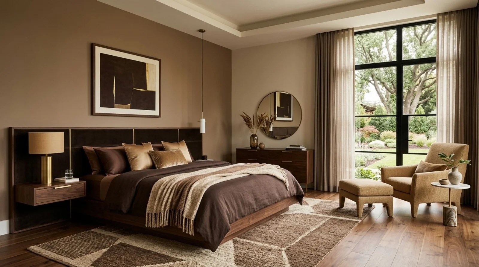
Mocha luxe is 2026's warm-luxury palette: deep mocha, taupe, and caramel layered with velvet, brushed brass, and matte, low-sheen finishes. It reads as quiet luxury rather than a statement color, which is why it holds up in both traditional and contemporary Sacramento homes.
- Core shades: deep mocha brown, muted taupe, caramel; test full-size samples in the room's real light before committing.
- Signature textures: velvet upholstery, brushed brass, rift-sawn white oak, limestone or travertine, textured wool and linen.
- Budget: a paint-and-accessories refresh runs about $15K-$25K; a mid-tier scope with custom cabinetry, textiles, and lighting runs $50K-$85K.
Get the undertone right and restrain the metallics, and the palette outlasts the trend cycle instead of dating with it.
Common Questions
| What is the mocha luxe color theme for 2026? | The mocha luxe palette leans into warm, earthy tones—specifically Sherwin-Williams’ *Urban Bronze* (SW 7048) and Benjamin Moore’s *Caramel Brown* (2169-20)—paired with neutral undertones like *Agreeable Gray* (SW 7029) for depth. This isn’t just ‘deep mocha’; it’s a curated mix of matte and low-luster finishes to mute harsh light in Sacramento’s mixed climates. |
| How can Sacramento homeowners incorporate the mocha luxe trend in 2026? | Start with *Urban Bronze* on an accent wall or built-ins, then balance it with *Caramel Brown* in custom cabinetry or upholstery—both are NKBA-approved for durability in high-traffic areas. Layer in textured linens (like *Linen Weave* from Restoration Hardware) and recessed lighting with dimmers to control the warmth, since Sacramento’s fog can wash out bold tones. |
| Which brands are highlighting mocha luxe colors for 2026? | Sherwin-Williams and Benjamin Moore both flagged these shades in their 2026 *Color of the Year* previews, though neither named ‘mocha luxe’—*Urban Bronze* was their top pick for ‘cozy sophistication,’ and *Caramel Brown* appeared in their *Living in Color* 2026 palette. No other major brand has matched this exact trio. |
| What textures and materials complement the mocha luxe palette? | Stick to *matte* or *low-sheen* finishes—glossy brass or high-polish surfaces clash with the palette’s warmth. Brushed brass hardware (like *Rejuvenation’s* *Mission* line) and *velvet* in deep greens or blacks add contrast without competing, while *oiled oak* or *walnut* cabinetry grounds the richness. Avoid metallic accents; they date faster in this palette. |
The First Major Design Move for 2026: Embracing Mocha Luxe as a Timeless Foundation
In the evolving landscape of 2026 interior design, the move toward embracing the 'mocha luxe' color theme begins with understanding its core appeal: rich, warm shades that evoke comfort without sacrificing sophistication. Across our active project specifications, we see designers integrating deep mocha browns with muted taupes and caramel hues to create a versatile backdrop that enhances both modern and traditional elements. Brands like Sherwin-Williams and Benjamin Moore are spotlighting these tones in their latest collections, emphasizing their adaptability for cabinetry, walls, and textiles.
Incorporating mocha luxe involves more than just choosing the right paint. It’s about pairing these shades with textures like velvet, brushed brass, and matte finishes to elevate the overall ambiance. For example, a Sacramento project might feature a deep mocha wall paired with plush velvet furniture and gold accents, creating a warm yet refined space. The key is balancing the richness of the color with restrained decor and layered lighting to foster a serene, luxurious environment that remains timeless.
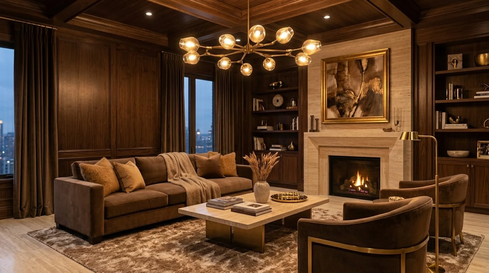
Material Specificity: Authentic and Premium Choices for Mocha Luxe
Authenticity-grade materials
- White oak (rift-sawn), for floors and slat detail; calmer grain than plain-sawn
- Brushed brass, for fixtures and accents to add warmth and subtle shine
- Velvet fabrics, for upholstery and drapery providing depth and softness
- Matte black hardware, to contrast with and elevate mocha tones
- Limestone or travertine, natural stone surfaces with warm undertones
- Textured linen or wool, for upholstery and window treatments
- Soft, low-sheen paints, to enhance depth and reduce glare
- Glass with warm metal frames, for mirrors, cabinetry, and lighting fixtures
Generic-grade tells we refuse to spec
- Standard painted drywall, avoid overly glossy finishes that conflict with luxe textures
- Synthetic fabrics, such as polyester or acrylic, which lack depth
- High-gloss lacquer, tends to clash with layered textures and feels less sophisticated
- Plastic hardware, which undermines the luxe aesthetic
- Carpet with synthetic fibers, opt for natural wool or silk blends instead
- Mass-produced fixtures, prefer custom or boutique brands for authenticity
- Cheap laminates, avoid for cabinetry or surfaces in favor of natural materials
- Unfinished or raw woods, unless intentionally part of a textured design
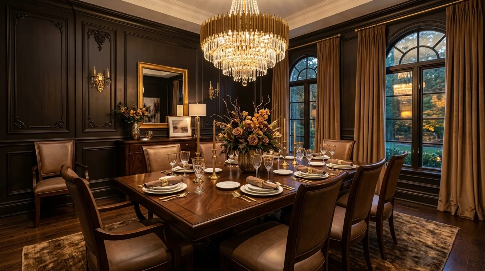
Choosing the Right Shades and Tones for 2026
The homeowner's key decision revolves around selecting shades that balance warmth with timelessness. The first question we ask is whether they prefer a more neutral backdrop or a statement color. For 2026, the trend leans toward deep mocha and caramel tones that add richness without overwhelming. Considerations include the natural light in the space, the existing architecture, and how textures will interact with the color. For example, a Sacramento living room with southern exposure can handle darker mocha walls, especially if paired with textured textiles and layered lighting. Conversely, spaces with limited natural light benefit from softer taupe or warm beige accents.
To guide this decision, I recommend creating sample boards with fabric swatches, paint chips, and material samples. Using a light meter or painter’s tape tests can reveal how colors will perform in real conditions. This ensures the chosen shades deliver the intended warmth and depth, avoiding the risk of a dull or oppressive environment. The goal is a nuanced palette that reflects the luxury of layered textures and natural materials, ensuring longevity and visual harmony across the home.
Material Choices that Elevate Mocha Luxe
When building a mocha luxe palette, material selection is crucial. The first real decision is whether to opt for authentic, natural finishes or rely on more economical options. Across our active projects, we favor genuine materials like rift-sawn white oak for flooring and cabinetry, which offers a calmer grain and durability. Soft textiles such as velvet or wool add plushness without sacrificing sophistication. The core idea is layering textures, matte finishes contrasted with brushed metals and textured stones, to create depth. In Sacramento, integrating local stone or sustainable wood options not only elevates the look but also aligns with regional values.
While some designers might consider high-gloss lacquer or synthetic finishes, we advise avoiding these in luxe applications. Instead, opt for matte, low-sheen paints and natural fibers that age gracefully. The right materials amplify the warmth and understated elegance of mocha luxe and ensure the space feels curated rather than manufactured. This approach results in a palette that feels authentic and timeless, perfect for the evolving tastes of 2026.
Mocha Luxe vs Other 2026 Color Trends
In 2026, mocha luxe stands out against other trending palettes like minimalist grays or Scandinavian pastels. The main difference is its emphasis on warmth and layered textures, making it more inviting and tactile. While modern minimalist designs favor stark contrasts and high-gloss finishes, mocha luxe advocates for matte textures, plush fabrics, and subtle metallic accents. Compared to the bright, energetic colors trending in some sectors, mocha luxe offers a calmer, more refined aesthetic that suits both traditional and contemporary homes.
Designers are increasingly blending these palettes, pairing mocha tones with crisp whites or muted pastels to create versatile, balanced environments. The key is understanding the emotional impact: mocha luxe evokes comfort and understated luxury, making it particularly versatile across different spaces, from primary bedrooms to welcoming living rooms. In Sacramento and the Bay Area, this palette’s adaptability helps maintain architectural character while embracing current luxury standards.
Observed Failure Modes We See in the Field
From our project debriefs and post-occupancy reviews, 2023-2026.
Choosing Too Dark or Too Light Shades
One common mistake is selecting shades that either feel too heavy or too insubstantial. Dark mocha colors can make a room feel cramped if not balanced with ample lighting and reflective surfaces. Conversely, overly light taupe or beige shades may lack the depth that defines mocha luxe, resulting in a bland or dated look. The cure is testing samples in the actual space, considering natural light and layering textures to achieve the right balance. In Sacramento, where natural light varies, this step is especially critical to avoid costly repainting or redesigns.
Overusing Metallics or Bright Accents
Another mistake is over-accessorizing with metallics or bright colors that clash with the subtlety of mocha tones. While metallic accents like brushed brass can elevate the look, too many can overwhelm the palette, disrupting the understated elegance. The key is restraint, using metallics sparingly on fixtures and decor, and choosing warm, muted tones for accents. This approach maintains the luxe feel without veering into gaudy territory, which is vital in maintaining timeless appeal in Sacramento’s diverse architectural landscape.
Neglecting Texture and Material Quality
Failing to incorporate high-quality, textured materials results in a flat, uninspired space. Relying solely on paint without layered textiles, varied finishes, and quality materials diminishes the richness that mocha luxe promises. It is essential to invest in authentic finishes like velvet upholstery, textured stone, and matte paint to create depth. In Sacramento’s older homes, this attention to material authenticity ensures the design feels genuine and enduring rather than superficial or trend-driven.
Ignoring Light and Proportion
Lighting and architectural proportions are often overlooked when choosing a dark or layered palette. Poor lighting can make mocha tones look dull or oppressive, especially in spaces with small windows or low ceilings. The first question we ask is whether the space benefits from layered lighting, ambient, accent, and task, to bring out the warmth and depth of the palette. Proper proportioning and lighting design ensure that the mocha luxe theme enhances the space rather than diminishes it, particularly in Sacramento’s varied home styles.
What's Going Out for 2026
- Overly bright or neon accents that clash with the warm tones
- Glossy finishes that compete with layered textures
- Cool-toned grays and blues dominating the palette
- Cluttered decor that overwhelms the subtle elegance
- Unmixed textures that feel flat or cheap
- Heavy use of synthetic materials
- Overly ornate or traditional details in a modern space
- Ignoring natural light when selecting shades
What This Costs in 2026
| Scope | Typical range |
|---|---|
| Refresh scope: repaint walls and update accessories | $15K-$25K |
| Mid-tier scope: includes custom cabinetry, textiles, and lighting | $50K-$85K |
| Estate-scale: full remodel with structural updates and high-end finishes | $200K-$400K |
Working Notes
What We Have Learned Doing This: Mocha luxe color theme: A Designer's Guide to the 2026 Look
“If a color is named in three magazines this year, it will date faster than its lifespan. Choose colors that have looked tasteful for twenty years.”
Undertone is the whole game. A color that looks calm on a chip can turn a room orange or green once it sits against the floor and the afternoon light, which is why we live with full-size samples before committing.
Most of the money that gets wasted is spent solving the wrong problem confidently. A homeowner asks for more space, every contractor agrees and prices an addition, and the real issue turns out to be light, or proportion, or one bad sightline. We make the room tell us the problem before anyone signs a demolition contract.
Order the long-lead items before anything else and design the sequence so the rest of the job can proceed without them. The appliance, the stone, the custom millwork set the schedule, and pretending otherwise is how a project loses a month it never gets back.
Specify for the next ten years, not the next photo shoot. The work that holds its value is quiet, well made, and a little bit boring on the day it is installed.
These notes come from our own project debriefs. Most were learned the expensive way the first time.
Sources & Professional References
This guide's positions on materials are grounded in published building-code, standards, and recognized design-authority sources, alongside Designed | Curated Interiors' verified credentials and active project files:
- American Society of Interior Designers (ASID): interior-design practice standards
- International Code Council (ICC): Chapter 8 Interior Finishes
- NKBA, Amy Kunst Member Profile (verified credential, NKBA Committee Member)
- Featured in: Homes & Gardens (design expert quote, May 2026) · Sacramento Love (guest author, 2024)
From Principle to a Real Room
A trend piece is the briefing document, not the deliverable. The pages below show how we translate these principles into finished rooms across Sacramento and the rest of Northern California.
- Sacramento & Bay Area Interior Design Services How we scope, source, and deliver work end to end.
- Interior Designer Hub, Sacramento Where most of our Sacramento work lives, the regional fit explained.
- Modern Tudor Homes: Authentic, Revival, and Neo-Tudor (A Designer Reference) Heritage-architecture renovation patterns from our project files.
- Japandi Living Room: A Designer's Guide to the 2026 Look The 2026 warm-neutral playbook applied to the living room.