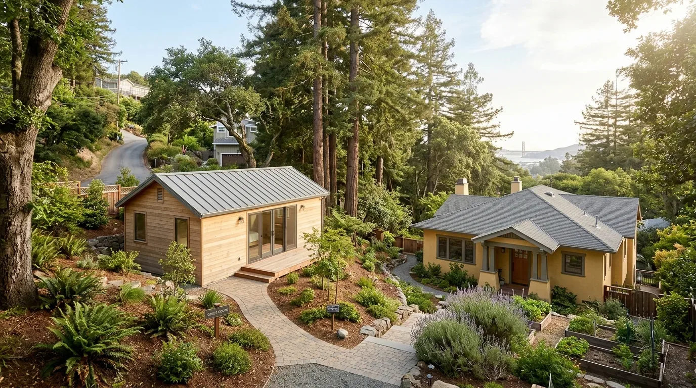
Greige mixes beige's warmth with the cool of gray. You see it a lot in Sacramento homes. Offers a neutral base. Sophisticated. Works modern or classic.
Our project files dive into using greige. Lighting and nearby colors change its look. We focus on warmth. Our greige tips fit NorCal's vibe and light.
Direct Answers (Greige Color)
| What is greige color? | Greige fuses beige with gray. Balanced feel. |
| How does lighting affect the appearance of greige? | Greige tone changes with light. Sacramento's varying light makes it look bluish or warm. |
| Why is greige a popular choice in Sacramento interiors? | Greige's muted, earthy qualities complement Sacramento’s natural light and landscape, making it an ideal neutral for regional homes. |
| What brands offer popular greige shades? | Sherwin-Williams has 'Accessible Beige'. Benjamin Moore sells 'Revere Pewter'. Great undertones. |
The First Major Design Move: Understanding Greige's Role
When introducing greige into an interior, the first move is to understand its fundamental nature: a nuanced blend of beige warmth and gray neutrality. Greige fits Sacramento's bright light and common home styles. Greige anchors a room. It's not too warm like beige, not chilly like gray.
Sherwin-Williams' 'Accessible Beige'. Benjamin Moore's 'Revere Pewter'. Both popular for undertone balance. Greige on walls pairs with wood or stone common in Sacramento homes. See how light alters greige in a room. Look at morning and evening.
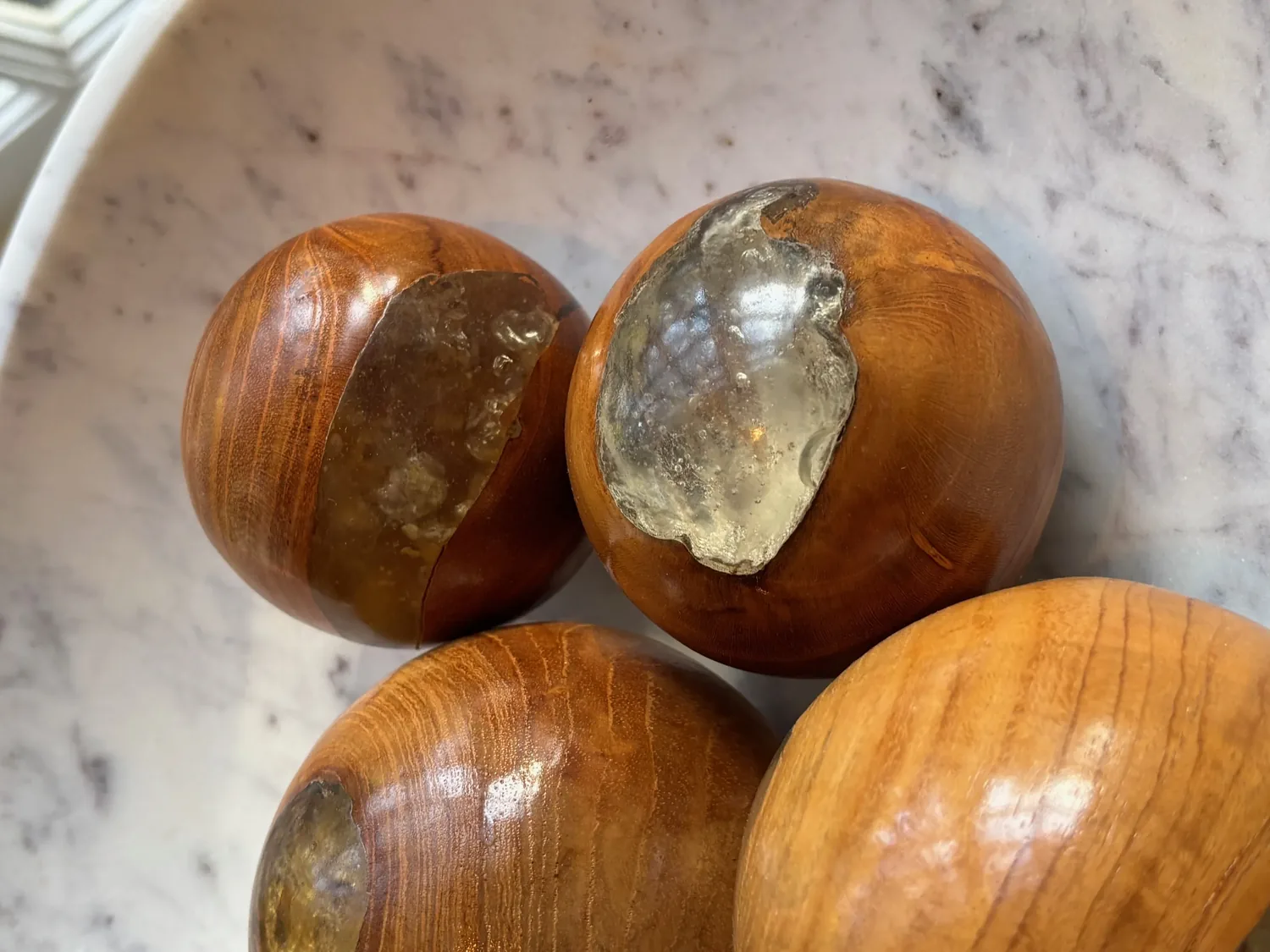
Material Specificity: Authentic vs. Generic
Authenticity-grade materials
- White oak (rift-sawn), for floors and furniture, offers a calm grain that complements greige walls
- Linen fabric, soft, textured upholstery enhancing the neutral palette
- Matte ceramic tiles, for backsplashes and floors, to avoid glare and maintain understated elegance
- Natural stone (granite or marble), adding depth and variation in countertops
- Walnut wood, warm contrast for cabinetry or accent walls
- Acrylic or matte-finish paints, for durability and subtlety
- Textured plaster finishes, for accent walls that add visual interest without color distraction
- Brushed nickel or matte black hardware, to keep finishes consistent with the understated aesthetic
Generic-grade tells we refuse to spec
- High-gloss paint finishes, which can create unwanted glare
- Vinyl or laminate flooring, which lacks texture and may look cheap
- Bright, saturated hardware finishes, that clash with muted palettes
- Overly glossy ceramic tiles, that reflect too much light
- Plastic or synthetic textiles, that don’t age well
- Paint with strong yellow or pink undertones, which can distort greige’s neutrality
Designer Decision Matrix: Which Greige Color Approach Fits Your Home
How we actually decide: match your situation to what we would specify, and the reasoning behind it.
| Your Goal | Best Solution | Why We Recommend It |
|---|---|---|
| Create a warm, inviting living room in a traditional Sacramento home | Use warm-toned greige like Sherwin-Williams 'Accessible Beige' | It adds warmth and complements the oak floors typical of older Sacramento homes, while maintaining neutrality for flexibility in furniture choices. |
| Achieve a sleek, modern kitchen with minimal fuss | Opt for Benjamin Moore's 'Revere Pewter' in a matte finish | Its balanced undertone works well with stainless steel appliances and natural stone, creating a timeless yet contemporary look. |
| Design a low-maintenance rental unit | Select a light, neutral greige in durable paint and finishes | Because Sacramento’s high summer temperatures and frequent sunlight can cause softer colors to fade or shift, durable greige keeps spaces looking fresh. |
| Add visual depth in a small space | Use a darker greige like Sherwin-Williams 'Gauntlet Gray' | Dark tones can make a small room feel more intimate and grounded, especially when paired with ample natural light. |

How to Choose the Right Greige for Your Space
The primary question homeowners face is which shade of greige best suits their space’s lighting and style. Does your room have lots of windows? That alters color vibe. Rooms with south-facing windows can pull out warmer tones in Sacramento. Cooler greige helps keep that yellow tint at bay. North-facing rooms? A warmer greige balances cooler light.
Consider what's around the room. Furniture, too. Warm oak floors? Try cool greige for contrast. Lighter shades open up small rooms. Darker ones cozy it up. We try samples at various times. Morning light, noon, dusk, each changes perception. Avoid costly errors. Match greige with Sacramento's changing light.
Selecting the Best Paint Colors and Finishes
Choosing the right greige paint involves more than just selecting a shade name. The finish matters as well. Choose matte or eggshell for walls. These finishes soften light, hide flaws. For trims or cabinets use satin or semi-gloss. They stand up to wear and clean easily. In Sacramento, go for paints that resist fading. They last despite strong sunlight.
Sherwin-Williams. Benjamin Moore. These brands deliver reliable greige choices. Test samples in the room first. Light and nearby colors alter how paint looks. Avoid errors by checking the color in place. Sacramento sun or winter light affects it.
Common Mistakes That Make Greige Look Cheap or Dated
One common mistake is selecting a greige shade without testing it in multiple lighting conditions, which can lead to unexpected color shifts. Skip those neon, bright accents. Too bright clashes with greige. Avoid high-gloss walls. They add glare, lose greige's subtle allure. Sacramento’s light changes a lot. Test samples around the room. Light plan? Verify it. Keep accents muted. Layer textures to enhance greige. Your home will look timeless yet fit in perfectly here. What's Going Out for 2026
What Greige Color Costs in 2026
| Scope | Typical range |
|---|---|
| Interior refresh with standard greige paint | $4K-$10K |
| Mid-tier renovation with custom greige finishes | $15K-$30K |
| Full estate-scale remodel with high-end materials | $40K-$80K |
Working Notes
What We Have Learned Doing This: greige color
“If a color is named in three magazines this year, it will date faster than its lifespan. Choose colors that have looked tasteful for twenty years.”
Hold off on paint choice until floors and lighting are set.
Trust forms in mundane talks. Structure stays, numbers shift, timelines slip. Clients forgive reality. They do not forgive being surprised by it.
A renovation is a dependency chain, not a list of tasks. A two-day cabinet delay quietly becomes a two-week slip by week sixteen because every trade downstream is holding a calendar. The least glamorous part of this work, and the most valuable, is keeping that chain from cascading.
Old houses lie, and so do new ones. Even a ten-year-old house will lie. Framing rarely matches old plans exactly. We stopped trusting old drawings and past contractor work a while back. 'It should be fine' means trouble. The budget needs a real line for what demolition will uncover, usually 15 to 20 percent once walls start opening.
These notes come from our own greige color project debriefs. Most were learned the expensive way the first time.
Sources & Professional References
This guide's positions on materials are grounded in published building-code, standards, and recognized design-authority sources, alongside Designed | Curated Interiors' verified credentials and active project files:
- American Society of Interior Designers (ASID): interior-design practice standards
- International Code Council (ICC): Chapter 8 Interior Finish Decorative Materials And Furnishings
- NKBA, Amy Kunst Member Profile (verified credential, NKBA Committee Member)
- Featured in: Homes & Gardens (design expert quote, May 2026) · Sacramento Love (guest author, 2024)
Frequently Asked
What is greige color?
How does lighting affect the appearance of greige?
Why is greige a popular choice in Sacramento interiors?
What brands offer popular greige shades?
When choosing a greige shade, what should I consider?
What finishes are recommended for greige paint?
Are there regional factors to keep in mind when using greige in Sacramento?
From Greige Color to a Real Room
A trend piece is the briefing document, not the deliverable. The pages below show how we translate these principles into finished rooms across Sacramento and the rest of Northern California.
- Sacramento & Bay Area Interior Design Services How we scope, source, and deliver work end to end.
- Interior Designer Hub, Sacramento Where most of our Sacramento work lives, the regional fit explained.
- Modern Tudor Homes: Authentic, Revival, and Neo-Tudor (A Designer Reference) Heritage-architecture renovation patterns from our project files.
- Japandi Living Room: A Designer's Guide to the 2026 Look The 2026 warm-neutral playbook applied to the living room.