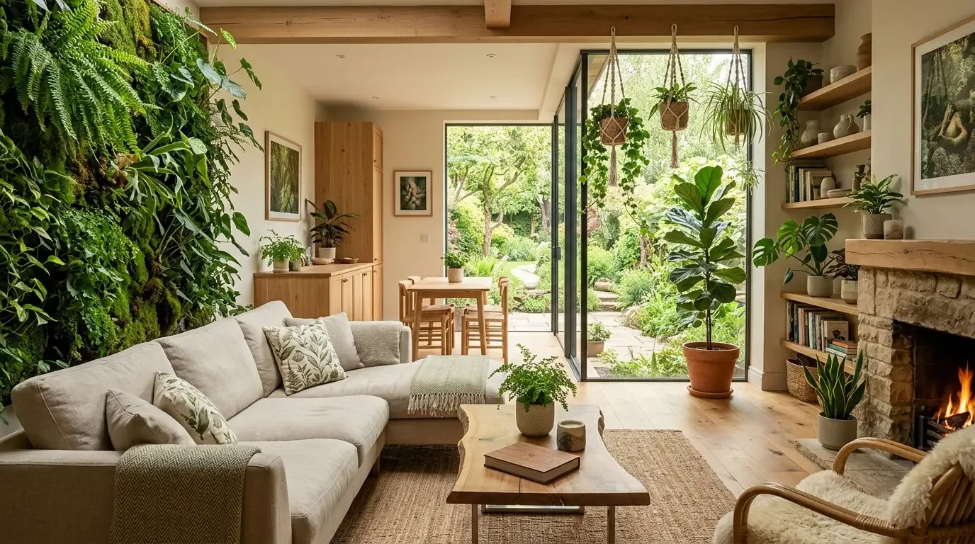
Take your time with red. It needs careful thought. Keep it bold yet friendly with other colors. Go for neutrals or colors that play nice with red. They shouldn't battle with the star of the show. By 2026, it's about keeping things simple. Use red sparingly to make it pop.
Built from our active project files, this guide will explore the best neutral pairings, shades of red that work well with other colors, and how textures influence these combinations. We’ll also show real examples of red-based schemes, tips for using red as an accent, and common pitfalls to avoid. As Sacramento designers, we focus on how these choices respond to Northern California’s light and housing stock, creating timeless yet fresh interiors that reflect regional character.
Direct Answers (Colors That Go With Red)
| What colors go well with red in interior design? | Soft taupe or cool gray can settle red nicely. Brings the room together. |
| How can I choose the right color to pair with red? | Check the red's undertone. Warm reds like warm friends. Cooler reds need cooler companions like ash. |
| Are there regional preferences for colors that go with red in Sacramento? | Here, dusty reds with natural textures fit the Sacramento vibe. |
| What tips help in using red as an accent without overwhelming the space? | Red as an accent? Always good. Team it with simple textures like linen to keep things mellow. |
The Power of Neutral Foundations in Red Interiors
When working with red, establishing a neutral foundation is the first step. Soft taupe or cool greige makes red pop without taking over. Those neutrals are winners in Sacramento, with shifting light and clean architecture.
Match your neutral to the red you pick. It changes everything. Warm reds like brick need warm neutrals. Try caramel or ivory. Ash gray or cool taupe sets off cooler reds like crimson. Creates a sleek vibe. Find neutrals that show off the red shade. The result? A chill room. Layer with linen or timber. Adds depth but won't clutter. In Sacramento, designs need to last and look good.
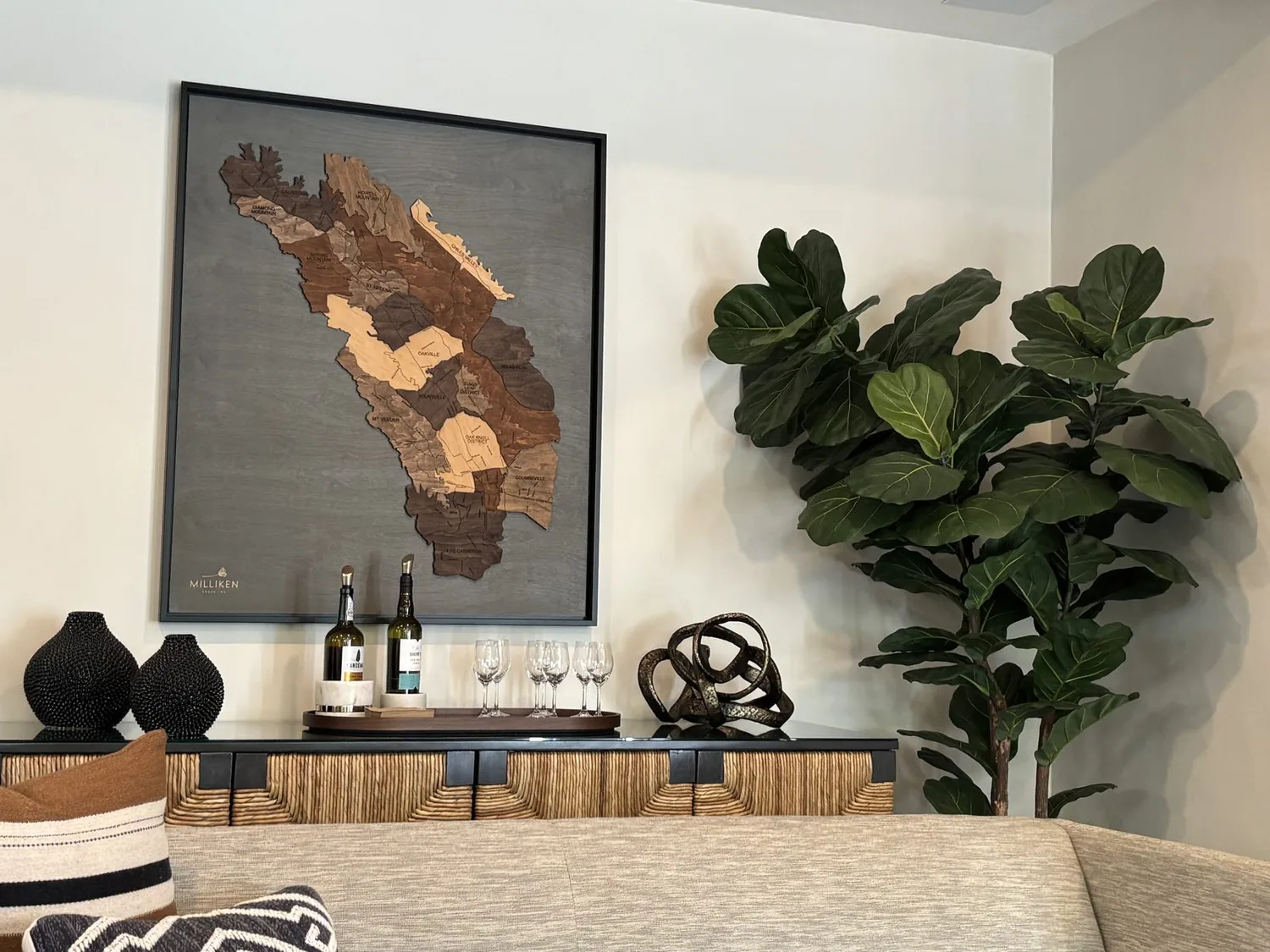
Material Specificity for Red Combinations
Authenticity-grade materials
- White oak (rift-sawn), for floors and furniture; calmer grain than plain-sawn, adding warmth without distraction.
- Matte plaster softens light and goes well with reds that aren't too bright. Use it with neutral tones.
- Linen gives a warm texture. It also adds subtle changes in color that can make a room feel layered.
- Bronze hardware glows warmly with earthy reds.
- Silk or matte keeps glare down. Adds depth.
- Reclaimed wood gives that authentic, weathered look. It pairs well with reds.
- Soft terracotta tiles are great for echoing the area's clay tones. Use those for accents or floors.
- Textured wallpaper like linen adds subtle patterns, giving walls depth.
- Use unpolished stone for fireplaces or accents. It grounds the room's colors.
- Matte black fixtures, create contrast and modern edge against softer reds and neutrals.
Generic-grade tells we refuse to spec
- Glossy finishes, tend to make colors look brighter and less sophisticated.
- Synthetic fabrics, lack the texture and authenticity preferred in regional homes.
- Bright white paint, can clash with warm reds and make a space feel sterile.
- High-gloss tile, may reflect too much light in Sacramento’s variable climate.
- Plastic hardware, cheapens the overall feel of a refined interior.
- Veneer finishes don't age well. They can look cheap.
- Avoid what's too trendy: neon or plastic won't last.
- Mass-produced cabinets? They lack local charm.
- Synthetic stone, less durable and less authentic than natural options.
- Ultralight drywall, can look flimsy and detract from the warmth of red accents.
Designer Decision Matrix: Which Colors That Go With Red Approach Fits Your Home
How we actually decide: match your situation to what we would specify, and the reasoning behind it.
| Your Goal | Best Solution | Why We Recommend It |
|---|---|---|
| Create a warm, inviting Sacramento home that feels timeless | Use muted terracotta reds with warm beige neutrals | This palette responds to Sacramento’s seasonal light and historic architecture, creating a cozy, regional feel that ages gracefully. |
| Achieve a sleek, modern look in a new build | Opt for cool crimson shades with gray neutrals | Cool reds and grays reflect Northern California’s contemporary housing and respond well to natural light, emphasizing clean lines. |
| In a small space, maximize light and perceived size | Light blush reds with soft off-whites | Light, warm reds bounce natural light and open up the space, fitting regional homes with limited square footage. |
| In a heritage Sacramento home, preserve character while updating | Deep brick reds with aged wood and brass | This combination respects the architectural integrity and regional material palette, adding warmth and authenticity. |
| Design a high-contrast, statement space | Bright scarlet with black and white | Bold contrast adds drama and modern edge, suitable for accent walls or focal points in contemporary interiors. |
How to Choose the Right Red and Complementary Colors
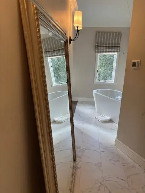
Homeowners often ask which colors go well with their chosen red. The first question we ask is: what is the mood or style they want to achieve? Careful with bold reds. Too much can clash. Red with taupe or gray feels balanced. Warm or cool, either can work. A deep brick red with muted beige or greige ties back to Sacramento's historic brickwork. Consider undertones. Warm reds suit caramel or cream. Cooler reds prefer ash or slate. Matte textures soften a look. Gloss or metallics add contrast. Test your color samples in the room. Light and architecture change everything. This approach suits those who value subtle elegance and solid materials.
Using Red as an Accent Without Overwhelming the Space
The second major decision is how much red to incorporate. Most ask about using red as the main feature or just an accent. In Sacramento homes, people usually choose to be low-key. Red works well as an accent. A feature wall or bold textiles add interest without taking over. We often do one muted red wall, leaving the rest neutral. Let red be the focus. It grabs attention without chaos.
One accent in small rooms. Less is more. Use red with natural wood tones or cushions. Brass or bronze can add detail too. Matte walls calm a room. Soft linings help. Glossy metals sharpen up a space. Local light and building styles make sure rooms stay both classic and fitting for the area.
Common Mistakes When Pairing Colors with Red
One mistake we see often is overusing bright, saturated reds paired with high-gloss finishes and synthetic materials. Too much stuff makes it feel tiny. Warm reds with cool blues? They clash. Reds need contrast to stand out. In Sacramento, simple, balanced designs win. Good aging materials are key. Think reclaimed wood or matte plaster. Let red lead. Keep everything else subtle. Avoid gloss. Use natural materials. Instead, use soft, organic textures for a classic design that suits the area. What's Going Out for 2026
What Colors That Go With Red Costs in 2026
| Scope | Typical range |
|---|---|
| Refresh scope, small updates like accessories or paint touch-ups | $5K-$12K |
| Mid-tier, new paint, textiles, and minor fixtures | $12K-$40K |
| Estate-scale, complete renovations with custom finishes | $40K-$150K |
Working Notes
What We Have Learned Doing This: colors that go with red
“If a color is named in three magazines this year, it will date faster than its lifespan. Choose colors that have looked tasteful for twenty years.”
Choose paint after floors and lights are in place.
After a while, bad taste isn't the biggest worry. Timing and details are. The look matters, yes, but can you build it as planned?
Think long-term, not just for the photo ops. Solid work may seem plain but it lasts.
Order long-lead items first. That keeps things moving. Appliances, stone, millwork, they dictate timing. Ignore that, and you lose weeks.
These notes come from our own colors that go with red project debriefs. Most were learned the expensive way the first time.
Sources & Professional References
This guide's positions on materials are grounded in published building-code, standards, and recognized design-authority sources, alongside Designed | Curated Interiors' verified credentials and active project files:
- American Society of Interior Designers (ASID): interior-design practice standards
- International Code Council (ICC): Chapter 8 Interior Finishes
- NKBA, Amy Kunst Member Profile (verified credential, NKBA Committee Member)
- Featured in: Good Housekeeping (storage and space-planning expert quotes, July 2026) · Homes & Gardens (design expert quote, May 2026) · Sacramento Love (guest author, 2024)
Frequently Asked
What colors go well with red in interior design?
How can I choose the right color to pair with red?
Are there regional preferences for colors that go with red in Sacramento?
What tips help in using red as an accent without overwhelming the space?
Why is it important to test paint samples when pairing colors with red?
From Colors That Go With Red to a Real Room
A trend piece is the briefing document, not the deliverable. The pages below show how we translate these principles into finished rooms across Sacramento and the rest of Northern California.
- Sacramento & Bay Area Interior Design Services How we scope, source, and deliver work end to end.
- Interior Designer Hub, Sacramento Where most of our Sacramento work lives, the regional fit explained.
- Modern Tudor Homes Heritage-architecture renovation patterns from our project files.
- Japandi Living Room Design The 2026 warm-neutral playbook applied to the living room.